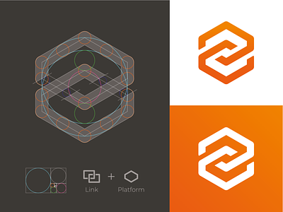
Link + Platform Logomark
Still working an identity for a digital platform. A couple revisions further we came up with this mark. Really like the harmony of this one. Using a hexagon gives depth to a flat shape. Let me know what you think!
More by Bram Huinink View profile
Like
