Smeaton Kerning
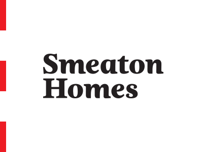
Smeaton Homes Logotype – checking kerning. Any issues? Yay or nae? FAO @Paul Galbraith, the H has been tweaked but the S remains as was – it became too unbalanced (maybe mainly my own skill...) trying to mimic the lowercase S in uppercase. I still like the S as it gives a sense of importance and prominence.
More by Owen Jones View profile
Like

