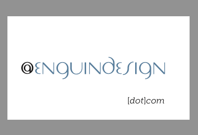
Enguin Design Business card front-high
Working on the designs for our new business cards, these are meant to be letterpress, blue for the company name, the @ and "[dot]com" would be pressed but uninked. I'm debating on whether to have the [dot]com set lower on the card, or higher (seen here).
The placement of elements in both are based on the golden section
In both variations, the "e" and "n" go from page margin to page margin. The @ hangs in the margin like an aside.
The difference is that in this version, the "[dot]com" sits where the page number would normally sit (imagine where the diagonal meets the far right margin line). In the l high version, it sits on the bottom margin.
Visually, I like the high version better, it sits tightly with the rest of the text and makes a proportionally appealing box with the card.
However, people who hold the card are more likely to feel the "m" with their thumb, Since they're uninked, the tactile feel of the pressed letters will be emphasized, lettings readers feel the words as they cognize "enguindesign.com" and "@enguindesign"

