Morshynska
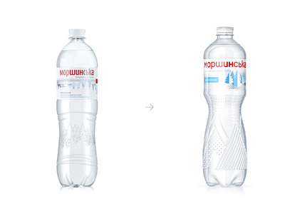
In addition to the bottle itself, Morshynska has also updated its look. The logo is now larger and simpler, the embossing of geometric spruces and mountains looks more modern and noticeable, and the size of the bottleneck and the crown-lid was reduced to make the bottle lighter. The label of the new Morshynska bottle has a more minimalistic look, with its shorter height and smaller number of elements depicted. Only elements key to brand recognition remain.