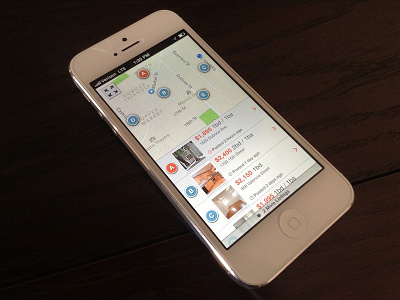
Map+List Hybrid View for Apartment Search app
My designs for a map and list hybrid view in an apartment search app that a company asked me to do conceptual mocks for 6 months ago. See the attachments for a shot showing all scroll levels (i.e. top, middle, bottom) as well as full pixel screenshots of the list scrolled to the top, middle, and bottom. A couple of UX notes:
1) Users would see this view after tapping a cluster dot on the zoomed out map. The letters are used to highlight where apartments in the list are on the map.
2) Users would be able to go back to the zoomed out map by tapping the arrows button in the top-left corner.
3) I took inspiration from Tweetbot for the "2 more listings" overlay at the bottom of the screen, so the user would be able to see how many more apartments are in the list, giving them a good sense of where the end was.
4) Orange dots represent listings that are new / recently posted; Blue dots represent listings that are haven't been posted recently.


