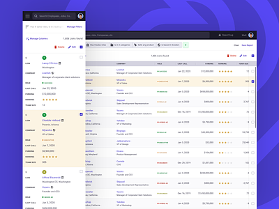
Mobile responsive table
Currently working on an existing project where lots of complex web app components need to be scaled down to mobile. 📲🙀
This screen shows my execution of the data table view, where the columns from one row in the desktop viewport are presented as rows on the mobile viewport. The trade-off is that this way makes the entire table quite long to scroll on mobile, but the advantage is that data is clearly scannable.
Another challenge for the mobile viewport was the filters. While there is enough room to play in the desktop viewport, on mobile space it at a premium. My solution was to have a temporary screen initiated by the “Manage Filters” link from the top.
This is a work in progress, so feedback is welcomed.
——
Think I can help you with a similar project? 🙋♂️ Let's talk.


