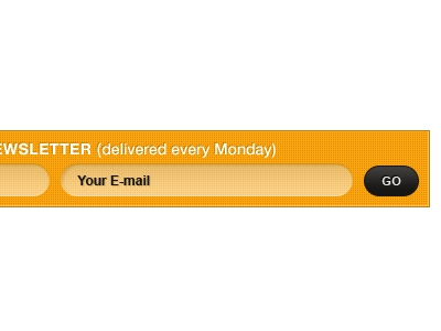
Email sign up box
An email sign up box from the same design as previous post.
It's weird how everything looks different when you isolate it. Here, again, looks like too much texture and the border seems too dark. Not sure about the drop shadow on "Your E-mail" either.
In other words, I liked it a lot better before I uploaded it here. :) More work to do!
More by Jen Germann View profile
Like
