iOS Notifications
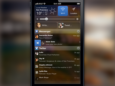
I think what needs redesign the most for iOS 7 is the Notifications tray. In this respect, I think Android is ahead, although I find the latter to be too busy and too open – you can have large banners, inconsistent sizes of icons, and the toggle UI for Wi-Fi, GPS, Sound is a bit heavy.
Widgets: As a user, what I access the most are the Weather, Wi-Fi, Location and Brightness, so that's why I decided to make them part of the Notifications tray. I left out Sound, Play controls, Screen rotation and running Apps because they're already part of the bottom tray. Social posting would be more engaging if it had faces. All of this area would be customizable and you would be able to add/remove widgets.
App Notifications: I think we should see faces or at least, App makers should be able to customize the icon next to each notification. That would make the notifications a lot more interesting. Also, I removed the repetitiveness of having the App name in each notification. Furthermore, I added the ability to swipe to delete, which I think is an intuitive and fun interaction.
Visual design: I went for a simple translucent UI with a blurred background like on OSX's Launchpad. It allows focus on the content and is pleasing to the eye, regardless of which background you use.
This is an experiment.

