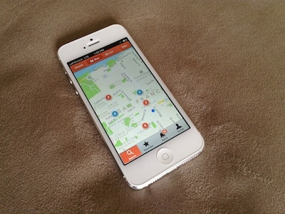
Apartment Search Map View
My design for a map view in an apartment search app that a company asked me to do conceptual mocks for 6 months ago. See the attachments for the 'full pixels' screenshot as well as the screenshot in a phone. A couple of UX notes:
1) Users would land on this page after specifying a city or zip code for which they wanted results. They would be able to go back to the search page by tapping the 'Search' button in the top-left corner. They could filter listings (by price, bedrooms, bathrooms, keywords, etc.) by tapping the 'Filter' button in the top-right corner.
2) I chose a segmented control for toggling between the map view and list view because it would make toggling easier for the user and it would be more apparent which view they are currently in.
3) Orange dots contain listings that are new / recently posted; Blue dots contain no new / recently posted listings.

