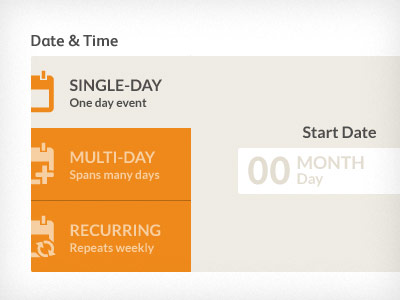
Date selector unit
This is a draft of a special custom UI element. Inspiration is drawn from various flat design kits, and smooth stepped data entry.
The goal here is to have the user first identify the type of event they're entering, then fill out the appropriate field.
Are the two orange tabs clear enough as alternative options? Does the shape that the 'single day' tab + main form area create imply that this is a tabbed selector? is it clear enough?
Any help and suggestions would be greatly appreciated!
More by Ricky Synnot View profile
Like
