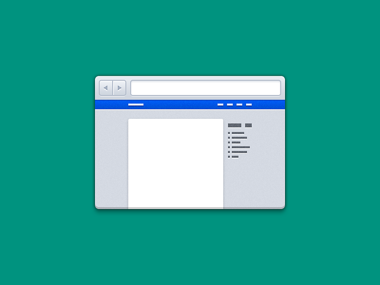
Web Design Icon - Take 2
Another take on the Web Design icon for my portfolio. I liked the old, Line Icon style, but didn't quite "Love" it for the portfolio.
Thoughts and suggestions are highly appreciated!
More by Umar Irshad View profile
Like
