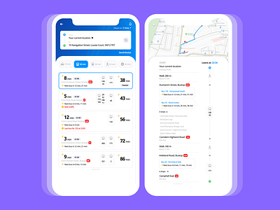
Public Transport Concept App
Hello! 👋
As a new project, I'm working on a public transport app design concept based on some of my personal pain points when using such apps (a.k.a Citymapper).
1. One thing I always missed out is the time of departure. I usually make plans ahead of time and I have a habit of checking/planning my journey at weird times of the night.
Hence, I often received a longer total time of travel because I did not change the time accordingly. I hope this new little design of time (top right corner) can strike off as more obvious and sharp for route planning.
2. Added little bits of details in rectangle boxes of suggested travel options, such as "Fastest time" . "from Dunranim street, Bus-stop BM", "Next bus in.." to show fuller information at one glance.
3. This was based on personal experience too because I was checking for the bus once - I wasn't aware that it was the last ride home and I missed it.
Involved alert symbols (yellow exclamation) to show unexpected events such as "slow traffic", "last bus". (Could also be used for other things that I didn't include, which are, accidents, bus stopping for drivers to change shift, delays, road closure especially etc.)
4. Lastly, on the route planning page, I wish maps were designed to be as precise as they can be because it would help users to navigate effortlessly (& brainlessly.. I supposed its a good thing when a user can use an application without thinking?)
I would appreciate any constructive feedback/ questions/ suggestion and come show some! ❤️
More visuals & reading 👁📖:
https://www.behance.net/gallery/92895851/Public-Transport-App-%28Optimizing-Safety%29
