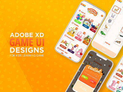
Kids Match and Learn Game UI
Not sure if this is 2020 friendly,
However I had a chance to work on this Kids learning app. I worked through its UX first.
Selected colors and fonts. After that I analyzed how kids would react to this app, how they would scroll. Should there be only horizontal scrolls or vertical?
I thought the maximum engagement of kid is what I need. So I implemented the UX and UI accordingly.
Let me know what you think dear!
This is Ali.!
Check out my works on behance or DM me for projects.
www.behance.net/azubairi
More by Ali Zubairi View profile
Like
