SportsCenter App
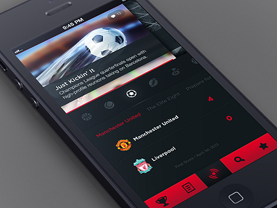
Here is another UI design for a sports app we are putting together which consists of over 100 different screens. Hopefully we are off to a good start.
Here is how this home screen works: (Starting from the top)
Highlights
You can swipe from side to side to see the most recent highlights which are revealed using some sort of cool and quick unfolding animation (working on it)
Categories
Swipe from side to side and tap to switch category. Once you tap, screen refreshes , layout remains the same, content changes.
Recent News
On this screen you are looking at the most recent soccer news, you can swipe from side to side to see different news feeds / modules such as scores, stories, etc.. and yea this would all change if you tap on a different sports category.
That's it for now.. let me know what you think!

