Mobile Improvements
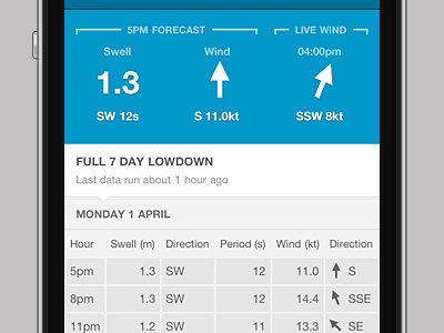
The swellcast forecast screens were well overdue for improvement on mobile, mainly because I found these screens so challenging. This is something I've been mulling over for so long, and am happy to say I finally pushed it live over Easter.
The next forecasts step and last live wind reading appear front and center. The charts were proving very hard to implement in the responsive layout, so I dropped these for a table based approach for the data.
iPhone render by Adrian Fahrbach.
More by Ray Stone View profile
Like
