CHRISIGN Studio logotype
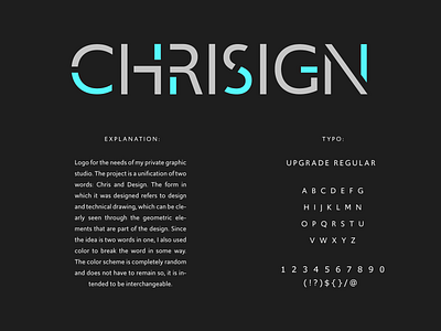
Logo for the needs of my private graphic studio. The project is a unification of two words: Chris and Design. The form in which it was designed refers to design and technical drawing, which can be clearly seen through the geometric elements that are part of the design. Since the idea is two words in one, I also used color to break the word in some way. The color scheme is completely random and does not have to remain so, it is intended to be interchangeable.
Press "L" of You like it.
Have a great day! :)
