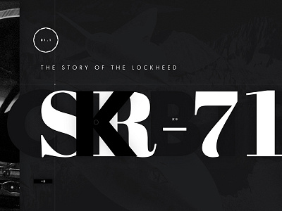
SR-71 Blackbird
Got the creative itch recently to do something primarily in black without actually using black*, which lead me to design one of those trendy one-screen mockups people on Dribbble are so fond of; only I didn’t want to do one for shoes. I stumbled across an article about the SR-71 Blackbird and figured that'd do.
I’ve made extensive use of decorate lines in the past and wanted to challenge myself to find a more useful way to incorporate them in this project. Since this hypothetical site would be telling a story, I decided to break the section and sub-section portions down using a military-inspired coordinate system, the idea being that the crosshair effect will move and intersect at different points on the page based on your location in the site. This also allowed me to play with multiple nested grids, which was a real treat to set up.
Keeping everything on subject, I added some decorative elements to the four corners and a circle in the true center of the page to simulate a camera, which seemed appropriate given that this was a spy plane. I’ve also been wanting to incorporate one of those spirograph things, but it didn’t feel right, so I redesigned it to mimic the basic shape of what you’d see looking at the back of the Blackbird’s engines.
And of course, I wanted to do something interesting with typography in addition to the modern treatment of mostly period-correct typefaces. This plane has several names, so I smashed them all together for a layered effect. The kanji says “habu” (I genuinely hope), which is a snake the Japanese thought the plane looked like? I don’t know, that’s the way the story goes.
I’m hoping I’ll get some time to create more screens for this, and then animate it. I’ve been fascinated by content floating and changing over a static background for a while now, and that begs for some motion design.
Thanks for reading all of this and checking it out! Full pixels attached. Figma preview available.
*which I failed at in about 5 seconds, when I was like “there’s a K in BLACKbird…I remember CMYK, I basically have to use black or someone’s going to revoke my design license.
