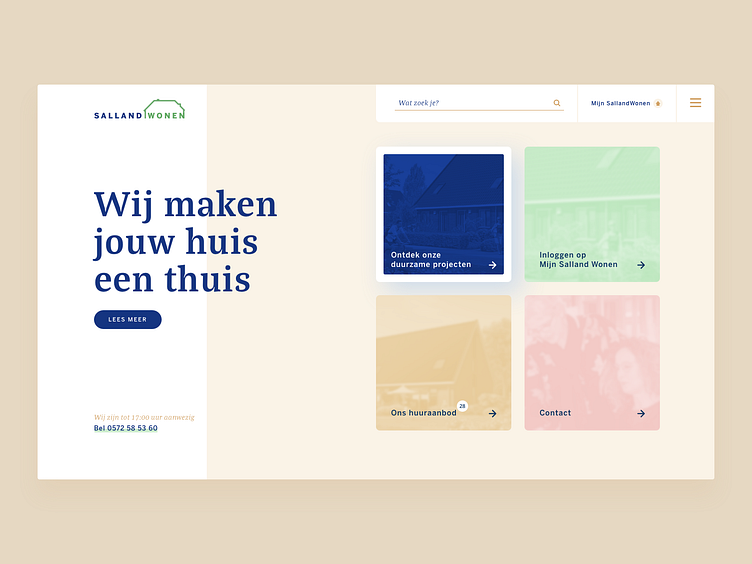
Website Homepage
I was quite annoyed by a website of this organisation. It wasn't focussed on the needs of the user. I tried to create a bit more focus and easily direct the user to the main sections of this website.
More by Mike Jansen View profile
Like
