Portfolio
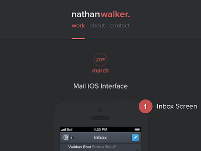
A concept for my personal website. I've been doing a bit of reading lately, a lot of design related articles by awesome people such as Andrew Kim, (amazing designer and writer by the way) and I've been inspired to work with space and typography to create more beautiful design.
I'm not totally convinced I've done that here, and @Coleman made the suggestion I use Helvetica rather than Proxima Nova, which I may well do. So, if you have any feedback whatsoever I'd really really like to hear it.
Cheers.
Attached the larger size.
More by Nathan Walker View profile
Like

