Car App — Choose Car & Orders
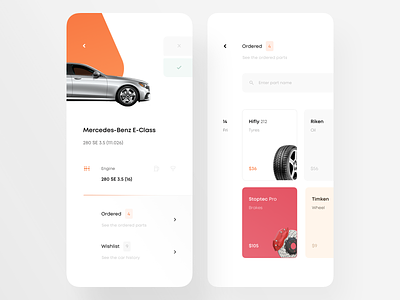
Hey guys, been working on this project for a daily basis. It's a car parts directory, on the left is car choosing screen.
The main UX thing I got in there was choose or deselect buttons, it's positioned on the upper right area, so that it's easier for a right thumb to click (sorry left-handed people). What do you think about that? Eager to your thoughts.
More by New Monday View profile
Like


