Redpoint Logo
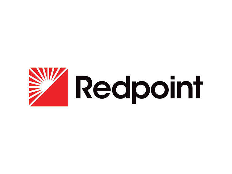


Latest logo design project wrapped up for my buddy's construction company, Redpoint. He is a West Virginia native and avid rock climber, which inspired his brand name choice. Redpoint is a rock climbing term that communicates experience, confidence, and overcoming difficulty.
Redpoint's pictorial mark is inspired the mountainous landscape of West Virginia. The exaggerated incline of the mountain not only provides balance and diagonal symmetry but also reinforces the message of perseverance. The imagery of the sunrise provides association to nature, newness (i.e. building), and consistency. The square shape of the mark further communicates the feelings of strength, reliability, and growth with precise attention to detail in its form.
The primary brand color, red, not only provides a visual association to the brand name in addition to its psychological association to strength and energy.
-----------------------------------------
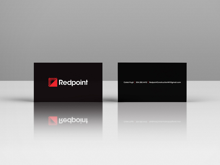
Any kerning recommendations? I noticed the R-e is a little loose. Any other areas your eye is drawn to?
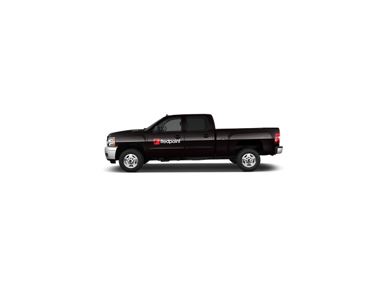
Open to all comments and critique!
Latest logo design project wrapped up for my buddy's construction company, Redpoint. He is a West Virginia native and avid rock climber, which inspired his brand name choice. Redpoint is a rock climbing term that communicates experience, confidence, and overcoming difficulty.
Redpoint's pictorial mark is inspired the mountainous landscape of West Virginia. The exaggerated incline of the mountain not only provides balance and diagonal symmetry but also reinforces the message of perseverance. The imagery of the sunrise provides association to nature, newness (i.e. building), and consistency. The square shape of the mark further communicates the feelings of strength, reliability, and growth with precise attention to detail in its form.
The primary brand color, red, not only provides a visual association to the brand name in addition to its psychological association to strength and energy.
-----------------------------------------
Any kerning recommendations? I noticed the R-e is a little loose. Any other areas your eye is drawn to?
Open to all comments and critique!