Ujo Music
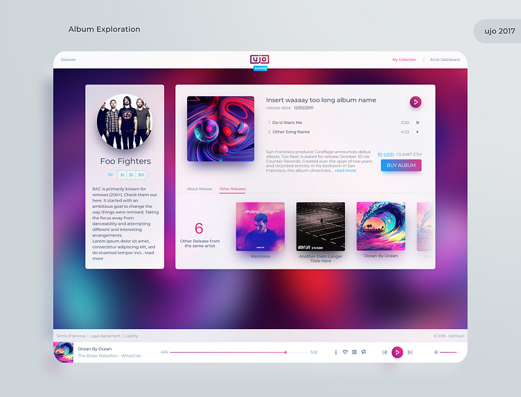
Exploration for the new UI/UX for Ujo music. Idea was/is to give the bands and users a "band home" feel to the page. Hence using the album cover as a blurred out background. This helped bands feel like their page is more custom and tailored to who they are. Playing around with different layout sizes and placements, as long as different designs for the player was fun. This then slowly evolved into something a bit different once feedback from research started to come in. But i'm generally happy with how this turned out. Some more screens from this project will follow, like registration for band, setting shares for each and uploading music.
If you have any questions/ideas don't hesitate to let me know. Cheers!
More by ConsenSys View profile
Like
