chikfila ui/ux exercise
So my creative director set a Basecamp daily check-in for our team asking the question:
“How would you improve the UI or UX for an App you used today? (Share in a tweet length message)”
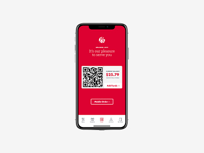
My response: “I'd make the welcome screen of the Chik-fil-A the pay screen with a button under the qr code to mobile order instead of a random welcome screen.”
But.... then I took it a step further and redesigned the Chik-fil-a welcome screen
