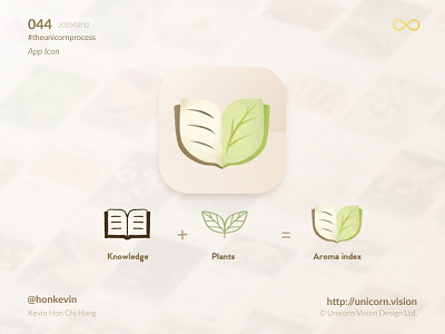
044 - Aroma Index App Icon
Keyword: App Icon
An app icon should not necessarily be the brand logo, but it should be designed to be recognizable and stand out on the home screen.
When you take a look at the app store and google play store, you may discover that the app icons in a specific category may have a very similar style. Examples like Whatsapp, Google Hangouts, Line, and WeChat, those icons are all in green color, all of a sudden, the blue color of Telegram stands out.
For the app icon of Aroma Index, when we were designing the icon draft, the first thing we did was not debating whether the icon should be descriptive or abstract. Instead, we browse through all the related categories, then found out the element in commons, design the icon base on the research. It is rational, not just a creative process.
By Kevin Hon Chi Hang on 2020/02/12
iOS & Android Download: http://aromaindex.com
Behance: https://www.behance.net/gallery/84356147/Aroma-Index-Branding-UIUX-App-Development
#theunicornprocess #unicornvision #honkevin #flutter #siuroma #aromaindex #ios #android
