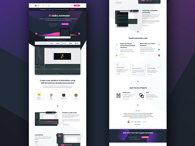
Product landing page
At Haiku, I was tasked with redesigning the company’s marketing website for the re-brand of Animator, Haiku’s first product. In this opportunity, I was given total freedom to define the new visual identity for the company, including typography, color palette and overall visual style. I decided to use an ample palette that would give us leverage once the company started launching more products. For the Animator landing page (pictured here) I chose to use keyframes as custom product miscellanea, envisioning a similar yet unique treatment for all future products.
More by Agustina Feijóo View profile
Like
