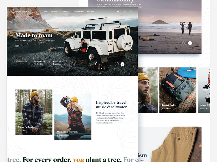
Passenger Concept Site
My concept direction for the branding & site progression of Passenger. The site balances product, story and UGC in an editorial flow. The typography is updated from a heavy weighted san serif font to a serif that balances between masculine and feminine. The icon has evolved to incorporate the elements of Passenger ethos in a more organic way. Lifestyle photography takes a more central role for the product, to give customers the sense and feel of roaming.
Full homepage design attached 🤙 Keep on roamin'
Passenger_concept_homepage.jpg
6 MB
More by Jon Line View profile
Like
