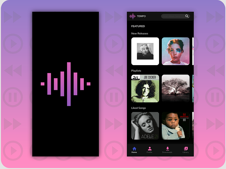
Music Player UI
Brief: To create a Music Player (Video Attached)
Idea behind the design: I created a music app called Tempo. I did some research before creating this app; I looked at a lot of the UI from known music apps. I made the pictures of the albums move horizontally. There is a button at the end of each that says, "find more!" That button helps the app, not look so cluttered with arrows next to the header of the section. The pictures are big so the user can see them, and there is a search bar with a placeholder inside it that gives an example of how to search for music. Finally, the screen is in dark mode, and this helps users better see the pictures of the albums, and the dark background helps so the user's eyes don't hurt too.
Enjoy the video attached under "Downloads." It helps one see how the app works and looks.
Thank you for liking and commenting!
Check out and follow my Instagram: @designsbymarianpd
Keep on Dribbble-ing!
