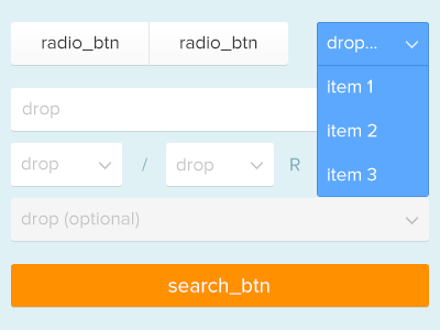
Configurator Concept
Interface concept for a configurator. I've flattened all UI elements as much as possible by using just one solid color per state and element. But it definitely needs some kind of depth or haptic in my point of view – even in a flat design. That's why I've used this sharp 90 degree 1px shadow underneath each item.
More by Nico Engelhardt View profile
Like
