NØ–ISØ Branding Update
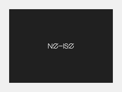


I just went through and did a little update from my NØ–ISØ branding. The previous version was kinda trash and rushed through, but I'm happier with this one. The whole idea with the name is that there's a duality of "no-ise" and "NO ISO" (with ISO being synonymous with noise in film, and referring to things that are random/without meaning). It works in my head at least. The previous iteration didn't really make that duality as obvious as I'd like, and this now uses my font (JWSans) as a base. The stand alone logo is also the "o" / "e" / "ø" that I think reads better as some mix of those things– and really the source of any duality in meaning.
It might all be trash to some because it doesn't map to the golden ratio, or some contrived ratio derived from the square root of the lunar orbital speed on a summer solstice. Cant win em all.
And if you're not familiar with NØ—ISØ, you can learn more on my site:
https://www.jonway.studio/output/no-iso
Pinterest:
https://www.pinterest.com/jonwaystudio/jws-n%C3%B8is%C3%B8/