Pie Chart for Virology Timeline
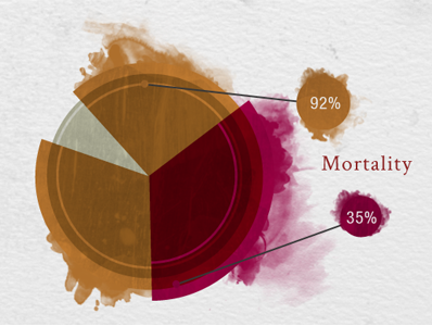
This is a pie chart created for an interactive timeline for the worst plagues in history. This pie chart is comparing the mortality of the Black Death and Small Pox.
This is a pie chart created for an interactive timeline for the worst plagues in history. This pie chart is comparing the mortality of the Black Death and Small Pox.
