HRone logo
A few months ago we worked on Brand Identity, Visual Design and Overall website, mobile & product structure for HRone.
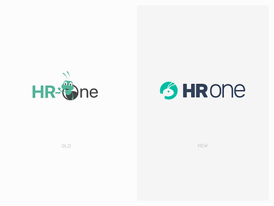
HRone needed a new branding to match with their new products & personality traits.
Initially, we started by exploring different looks with and without ‘ant’ shape ( in a more symbolic way).
Initial concepts :https://dribbble.com/shots/9953538-Branding-HRone
On testing, the feedback came out that they want to retain & preserve the actual ‘ant’ in logo.The idea was to keep a balance between maintaining the connection with current loyal customers and updating to a more modern, subtle, simplified and contemporary style.
The new logo was conceptually flexible for former and future customers. The current users will be able to recognise the evolution, while the new logo and typography will be able to resonate with new future users.
