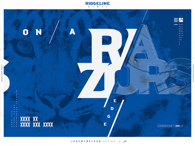
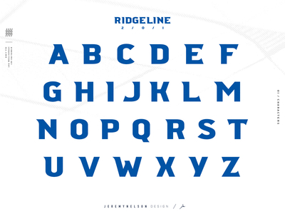
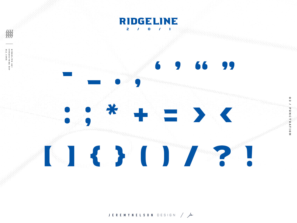
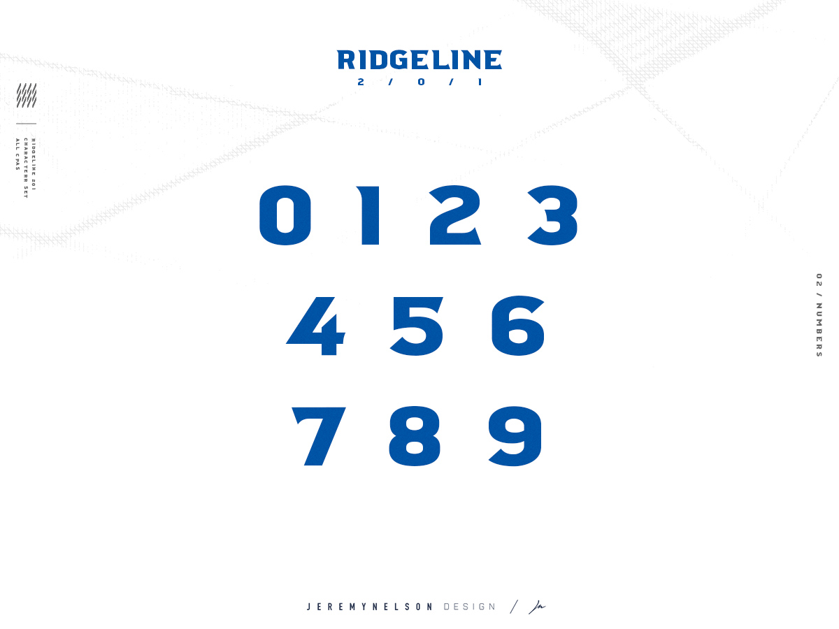
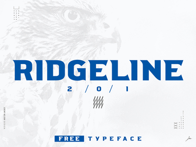
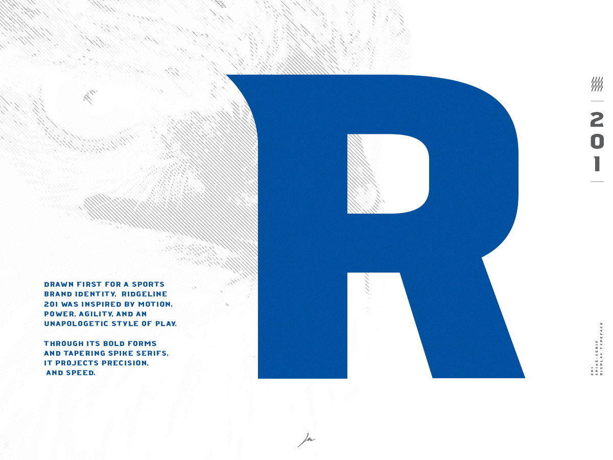
Ridgeline 201 | FREE Font | Spike-Serif Display Typeface
5 • 7
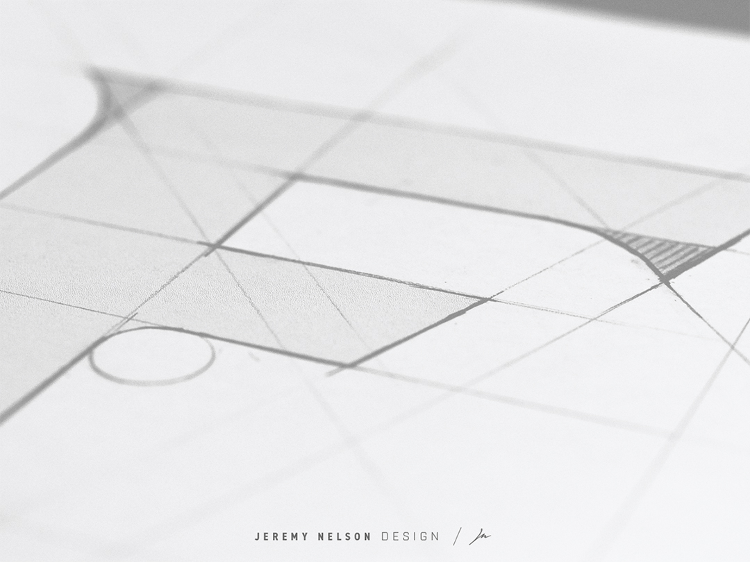
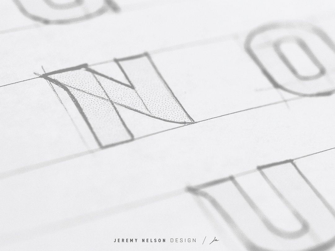
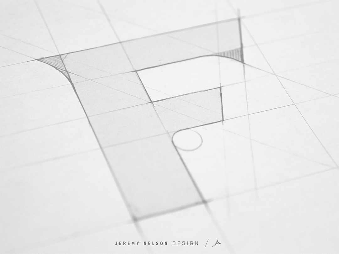
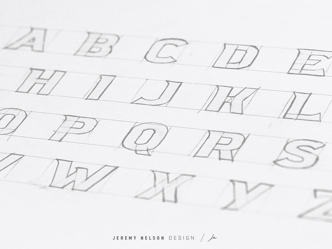
All-caps display typeface originally drawn for a sports branding identity system.
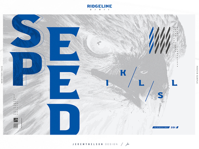
5 • 7
All-caps display typeface originally drawn for a sports branding identity system.


