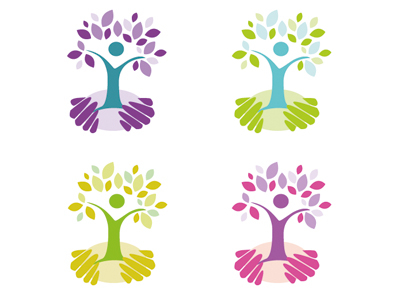
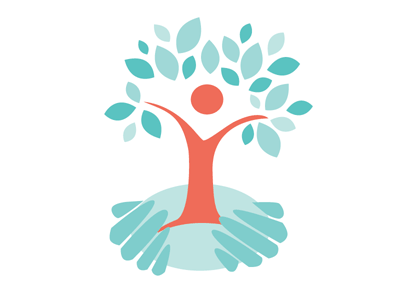
Rejected rebrand for Australian (Victoria) based care organisation. Project did not reach final stages due to restructuring and revision of brand strategy.
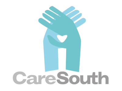
An early incarnation of the rebranding for CareSouth which utilised hands over one another forming both an elongated house-like structure (symbolising a safe haven) and a heart shape where the two elements meet.
Rebrand for a care organisation working with children, families, and the community. Their aim is to encourage growth and strength of individuals, with the support of the organisation.