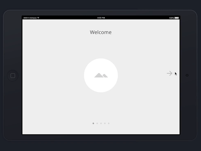
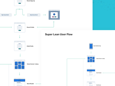
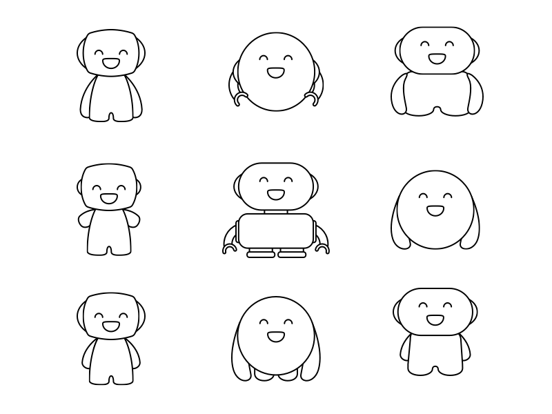
Bookbot
16 • 7
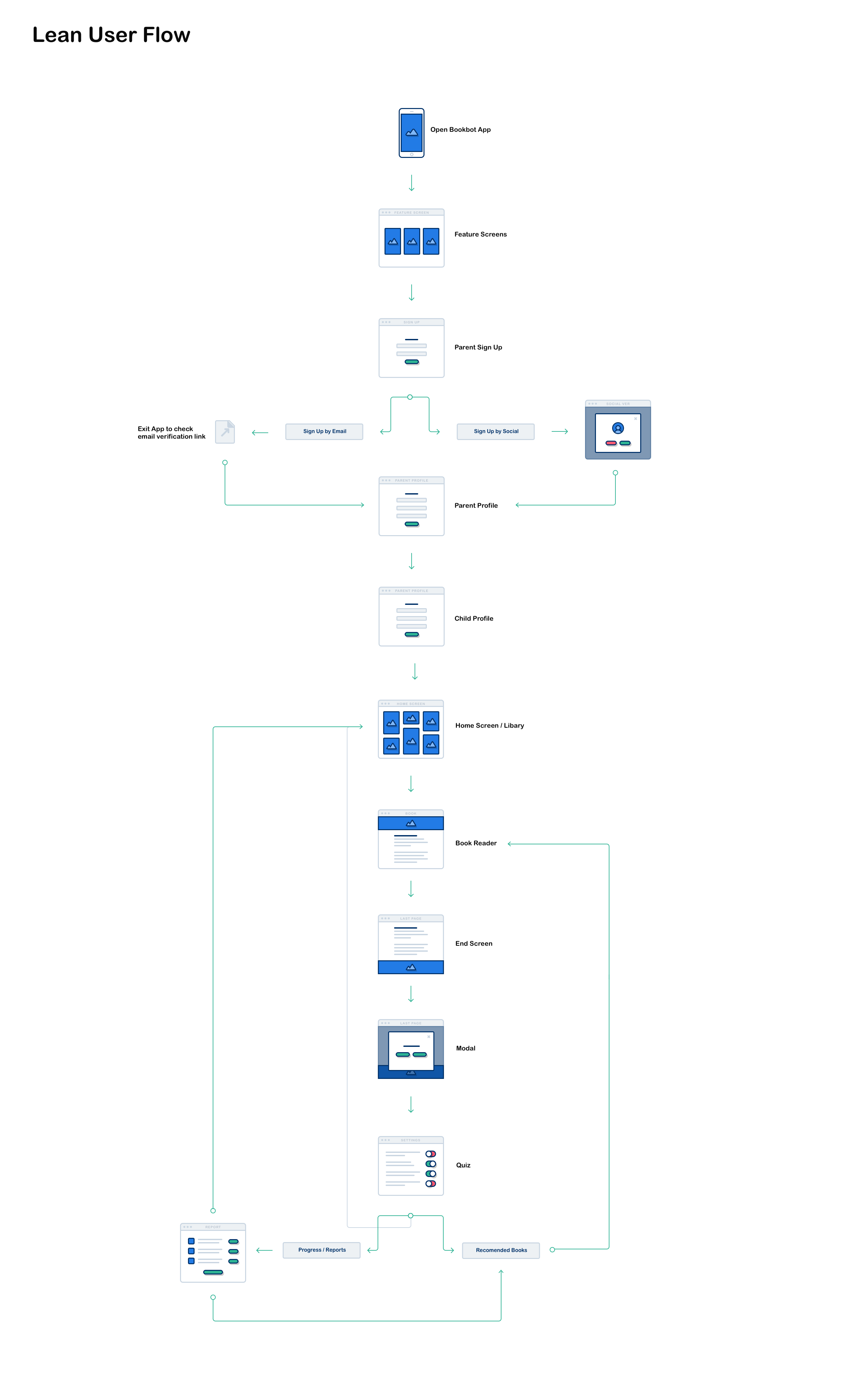
Bookbot is an exceptionally powerful tool that can make a real impact in the lives of children with reading difficulties.
More Projects


16 • 7
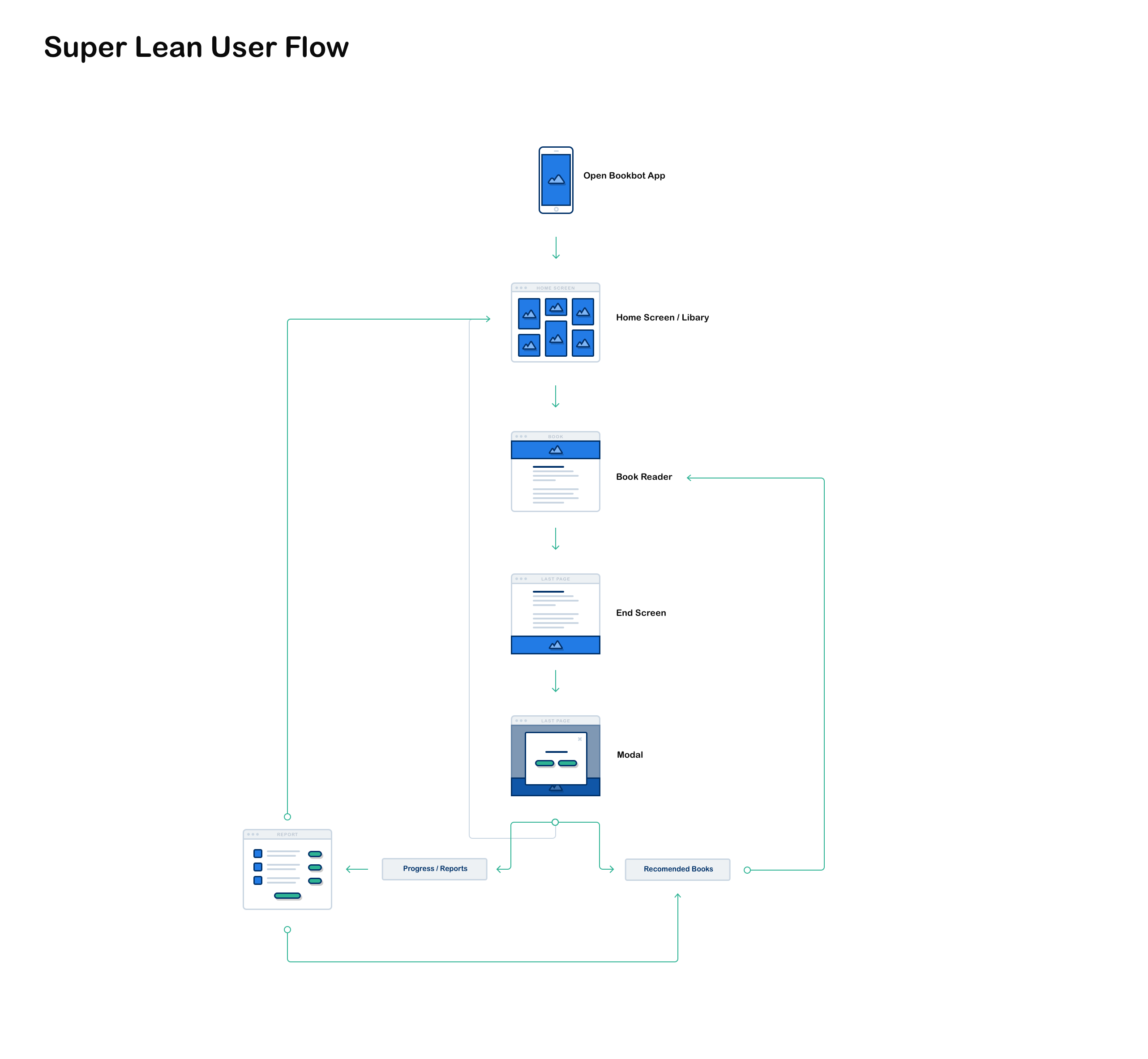
Bookbot is an exceptionally powerful tool that can make a real impact in the lives of children with reading difficulties.


