Logo for a local architect. We went through a few variants, but ultimately we settled on his signature to represent his brand. At Rothrock the brand should be as unique as the design and construction as their work.
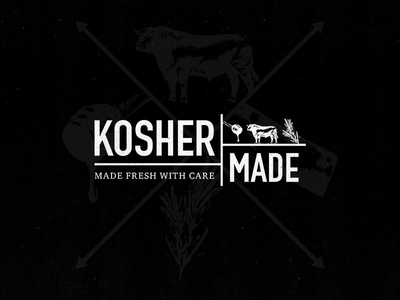
Worked up this logo a while back. They wanted something simple, but slightly dated (lol). Strictly black and white to express simplicity with the brand and their products.
Please like and enjoy!
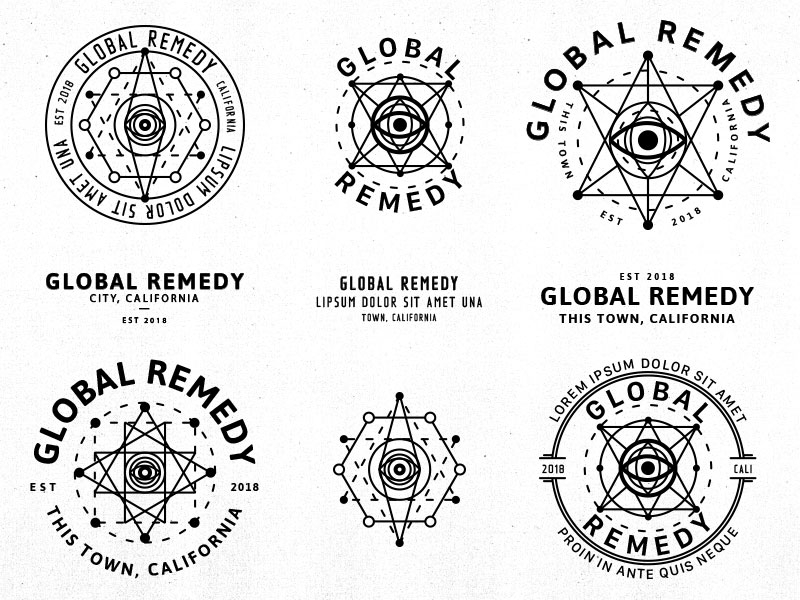
There are a number of additional variations that were worked through, but these wound up at the top of the list before eventually getting the axe. Oddly enough the final version went in a different direction. So these are up for grabs if...
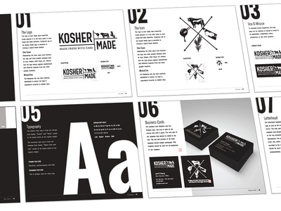
Its been some time since I posted anything, but Ive been very busy. Here is a snap of a style guide I recently put together. Sometimes we dont need to muddy things up with color.
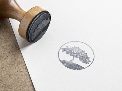
Rejected logo mark from a project a while back. This is an underwriting firm in tropical and prestigious area of Miami. They had an affinity towards the sea grape tree.
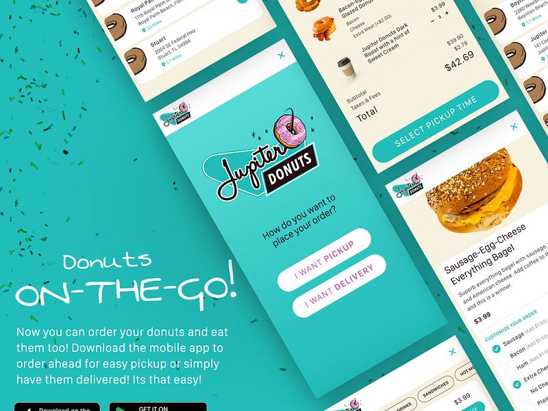
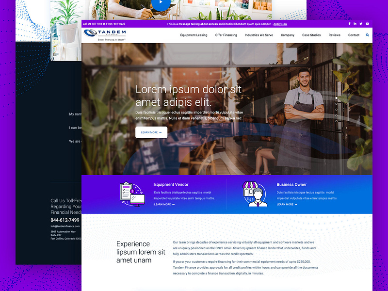
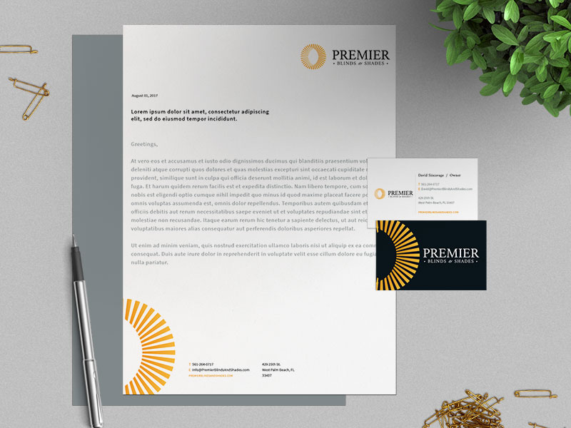
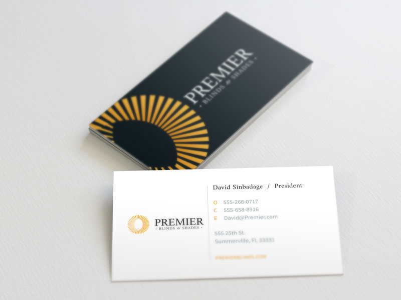
Earlier this month I finalized a quick branding project. Cards letterhead, logo, and website. Overall a fun project that finalized faster than anticipated, which is always great.
Please like and enjoy!