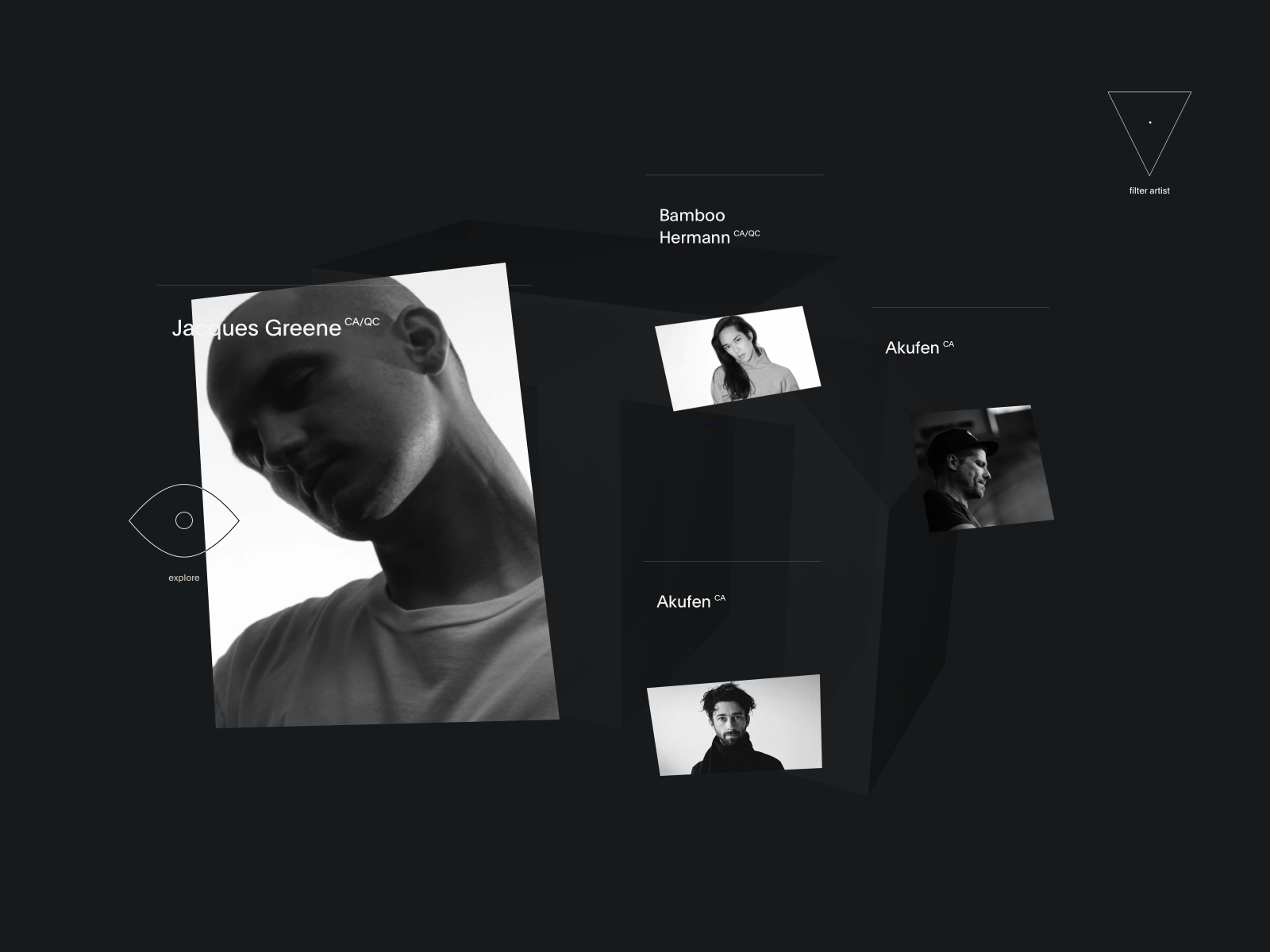
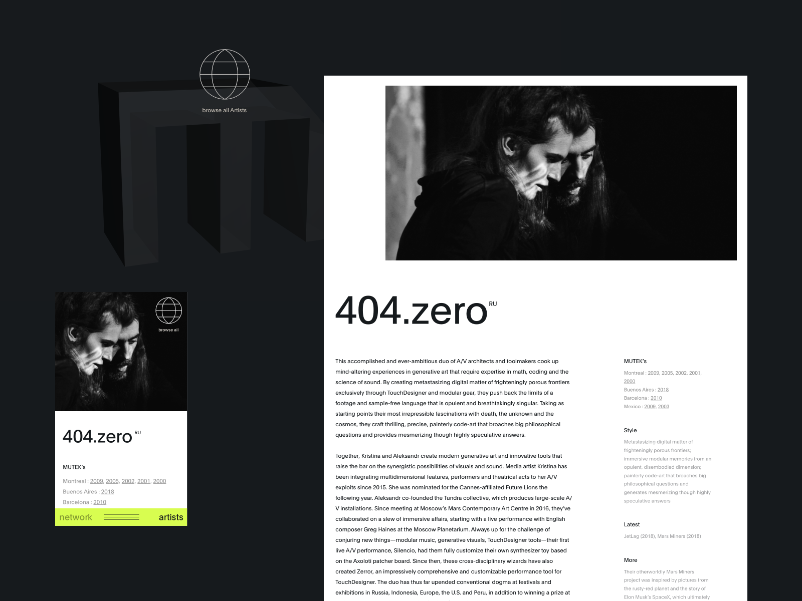
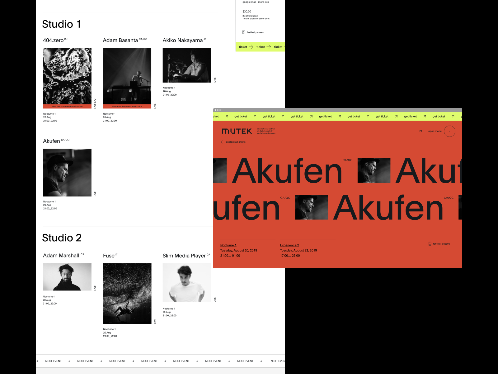
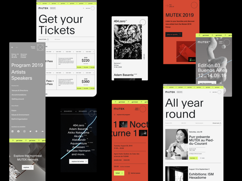
The artist page gathers all the artists who participated in the festival. The navigation is the same as for the news page to not lose the user.
You can see the entire artist page as attachments.
Full project on behance soon.
Motion wi...
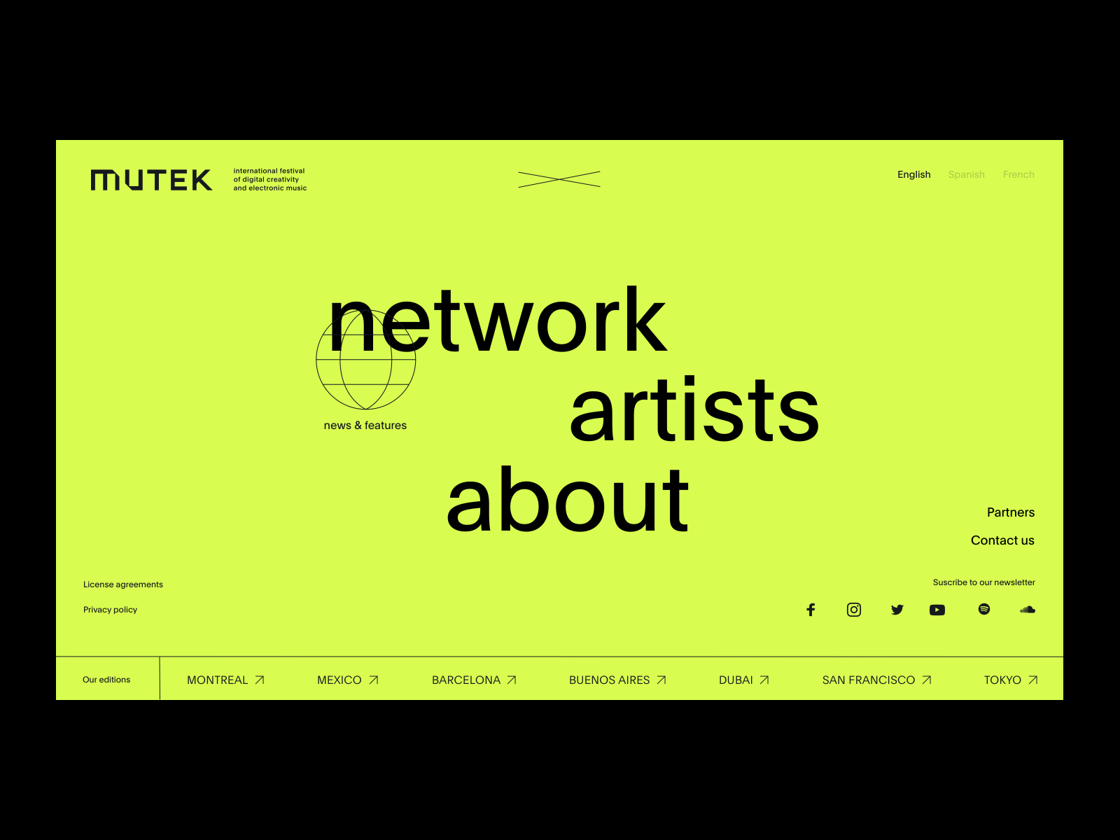
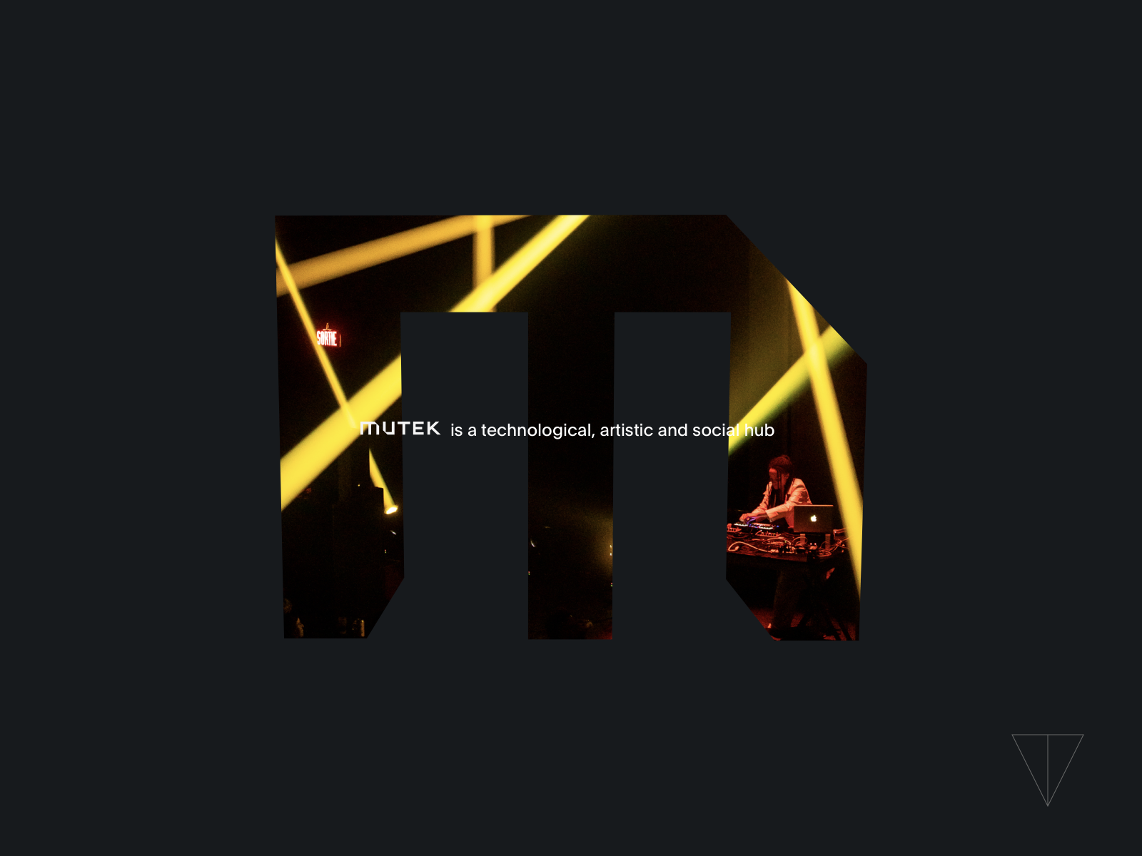
The M of the mutek logo is always present on the site and is our guiding thread through the experience. It allows you to quickly go back to the feed once you've opened a news or an artist bio.
The cursor changes to show the type of arti...
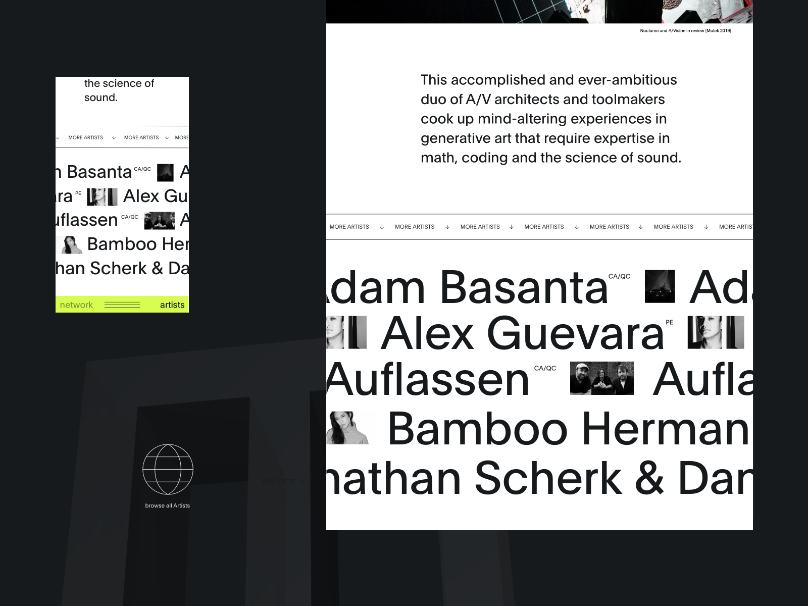
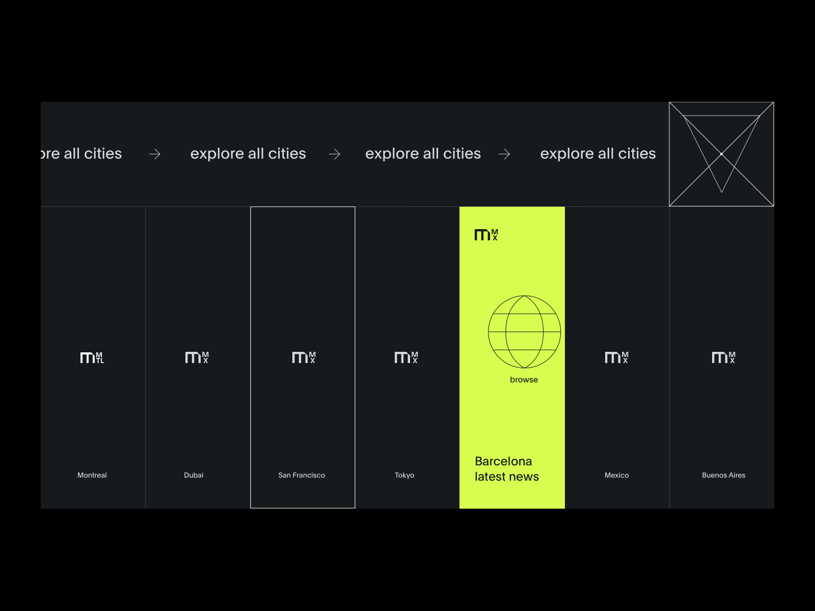
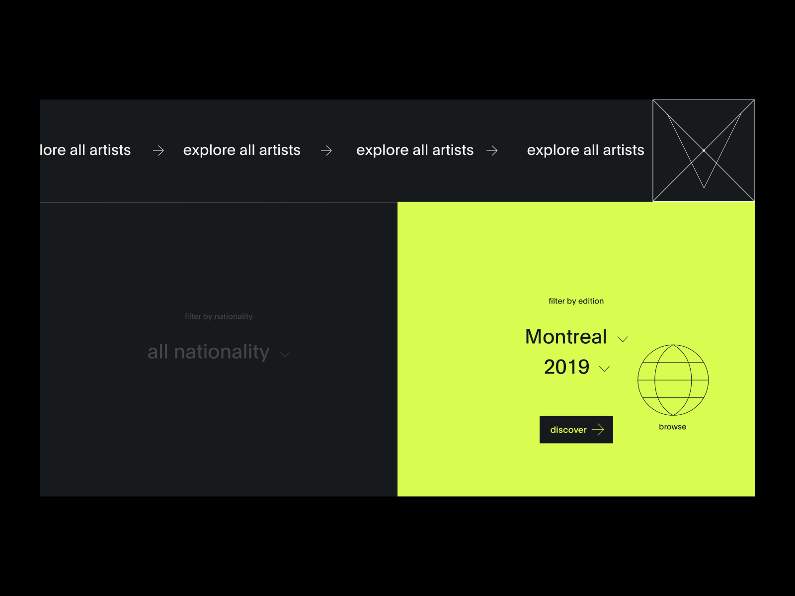
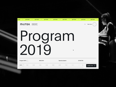
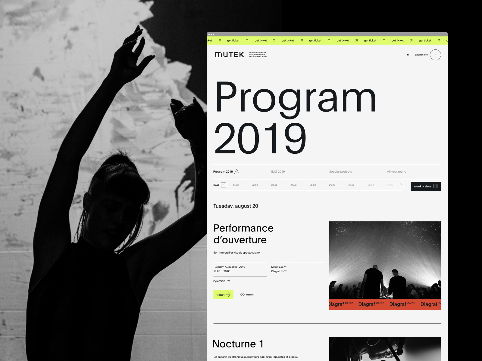
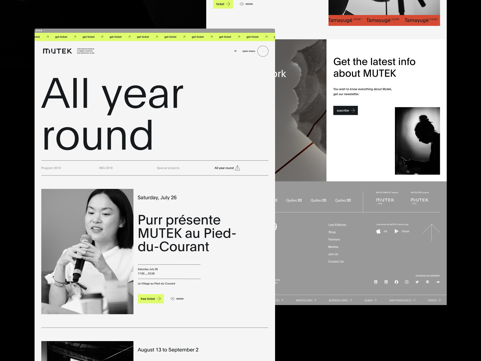
The menu and filters are sticky to simplify the user's navigation. The electric yellow is exclusive to actions that allow you to change pages.
You can see the entire menu and filter as attachments.
Full project on behance soon.
Motion...
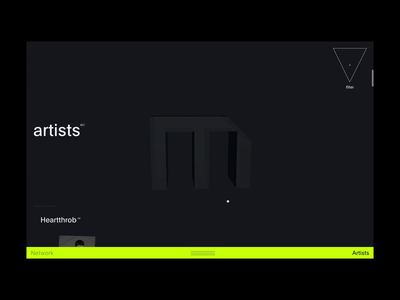
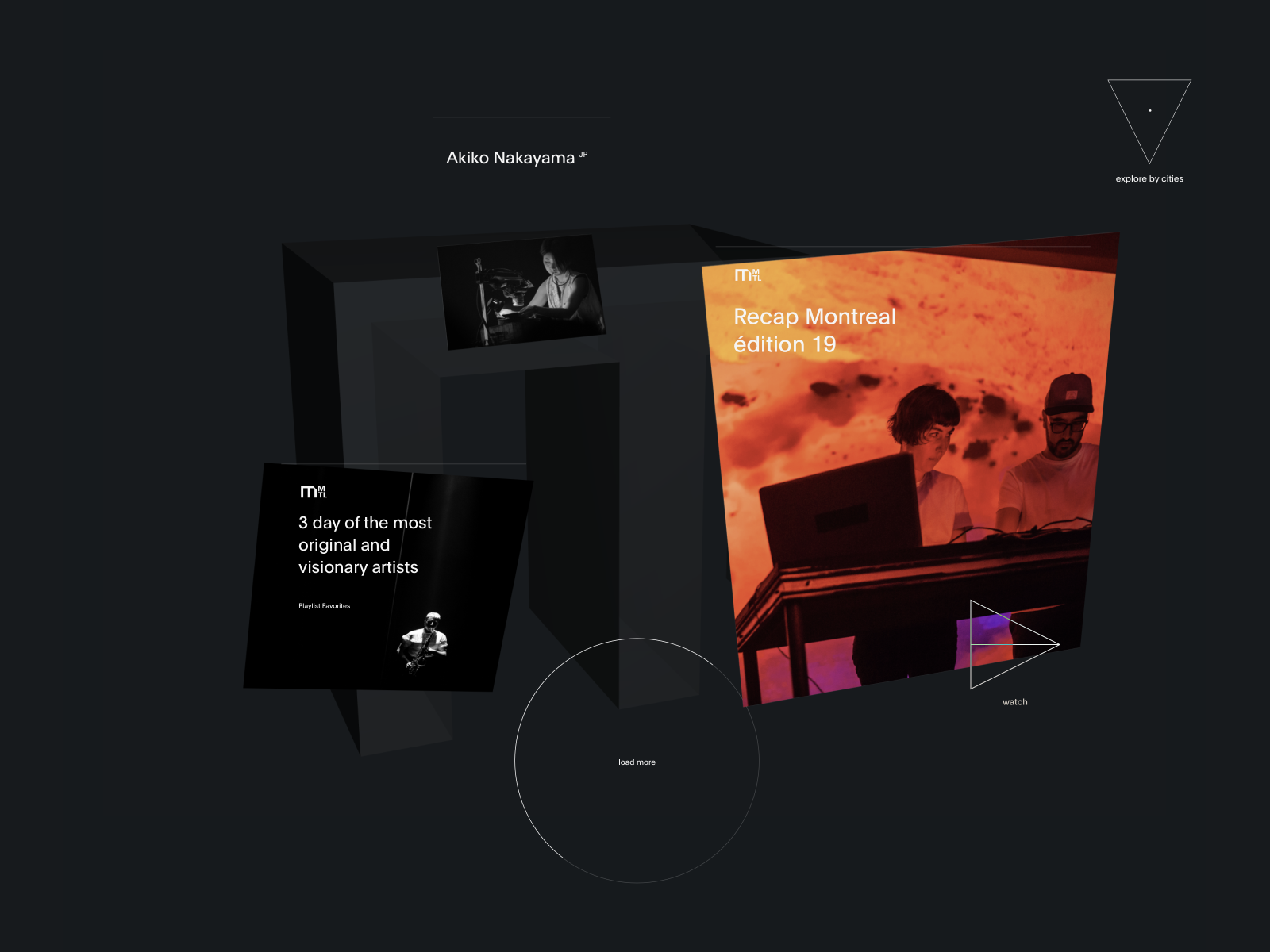
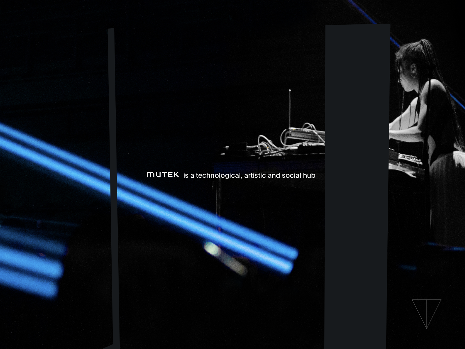
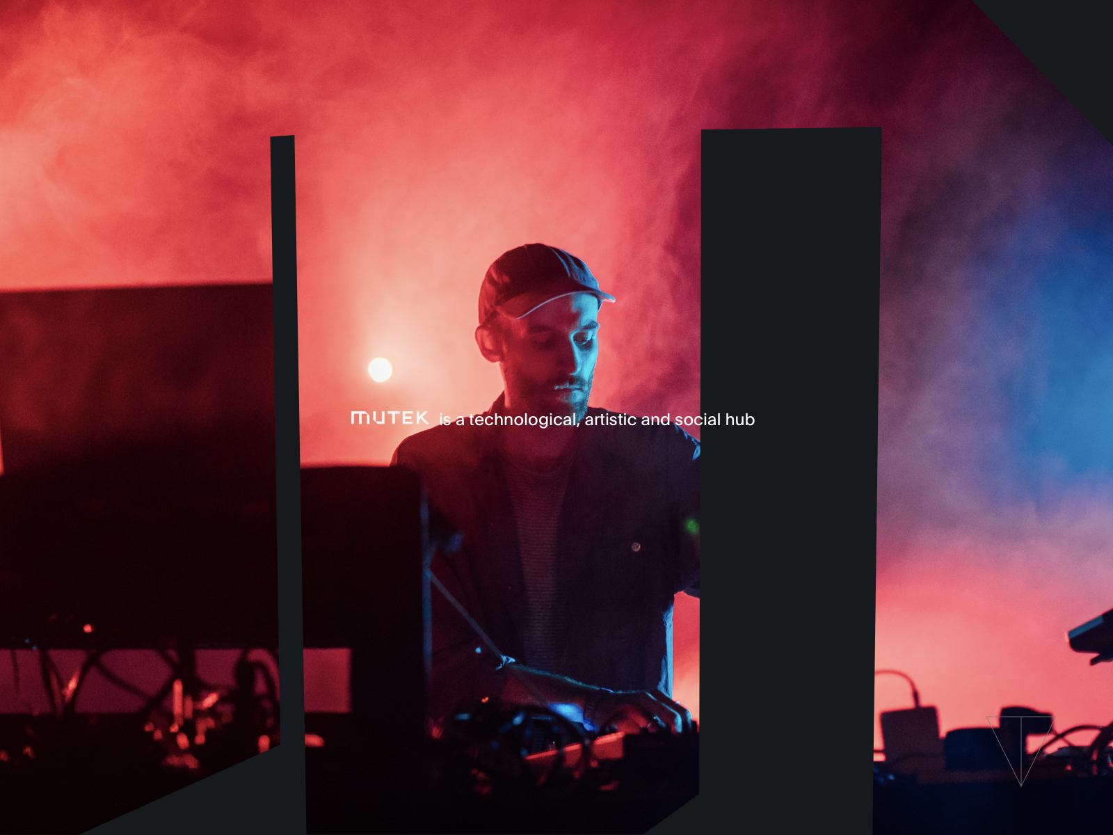
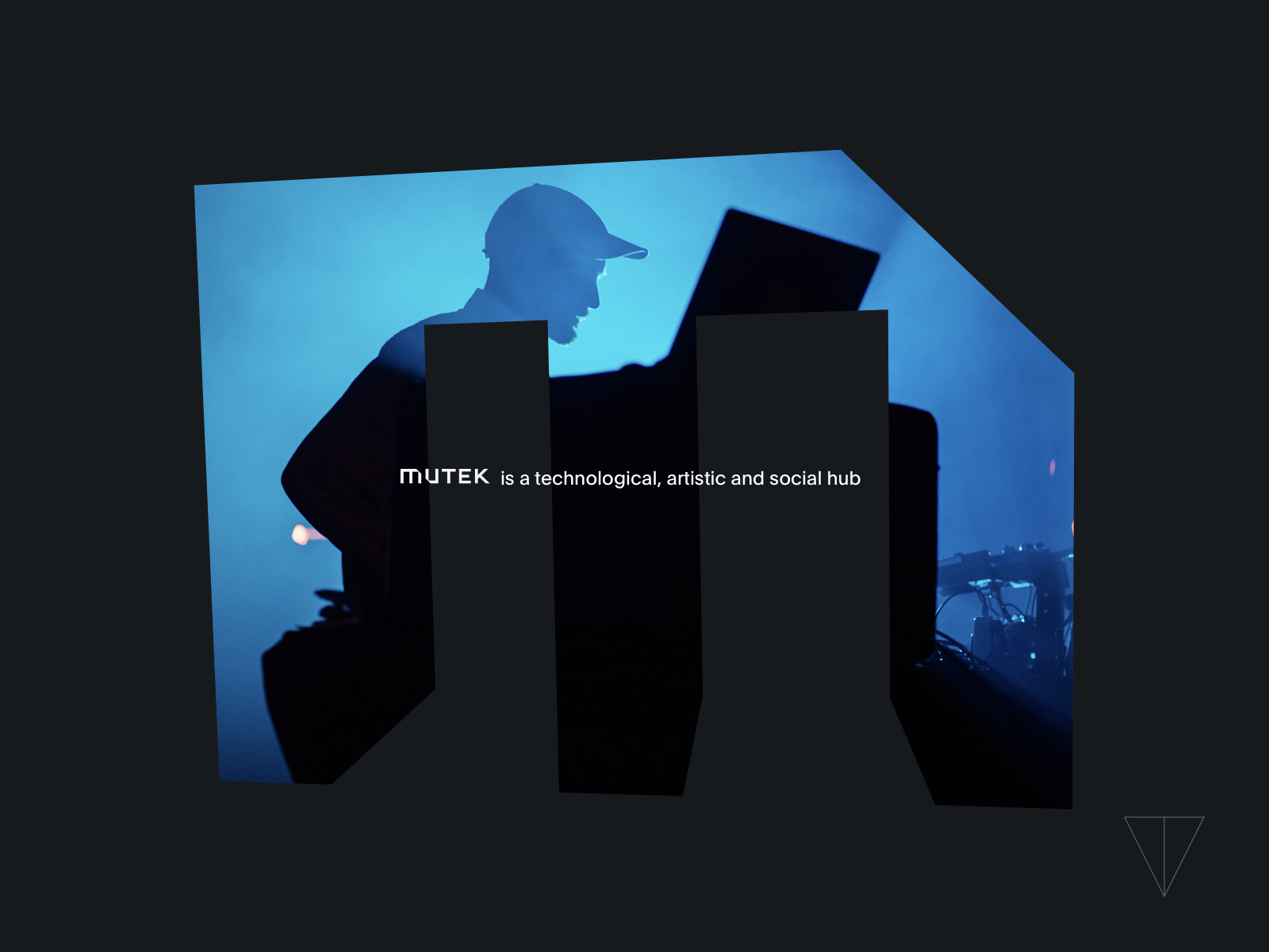
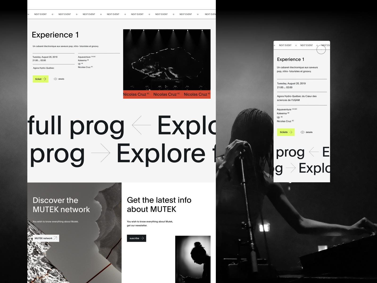
Interactive introduction with scrolling and cursor orientation when the user first comes to the site to immediately understand what Mutek™ is.
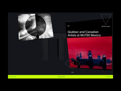
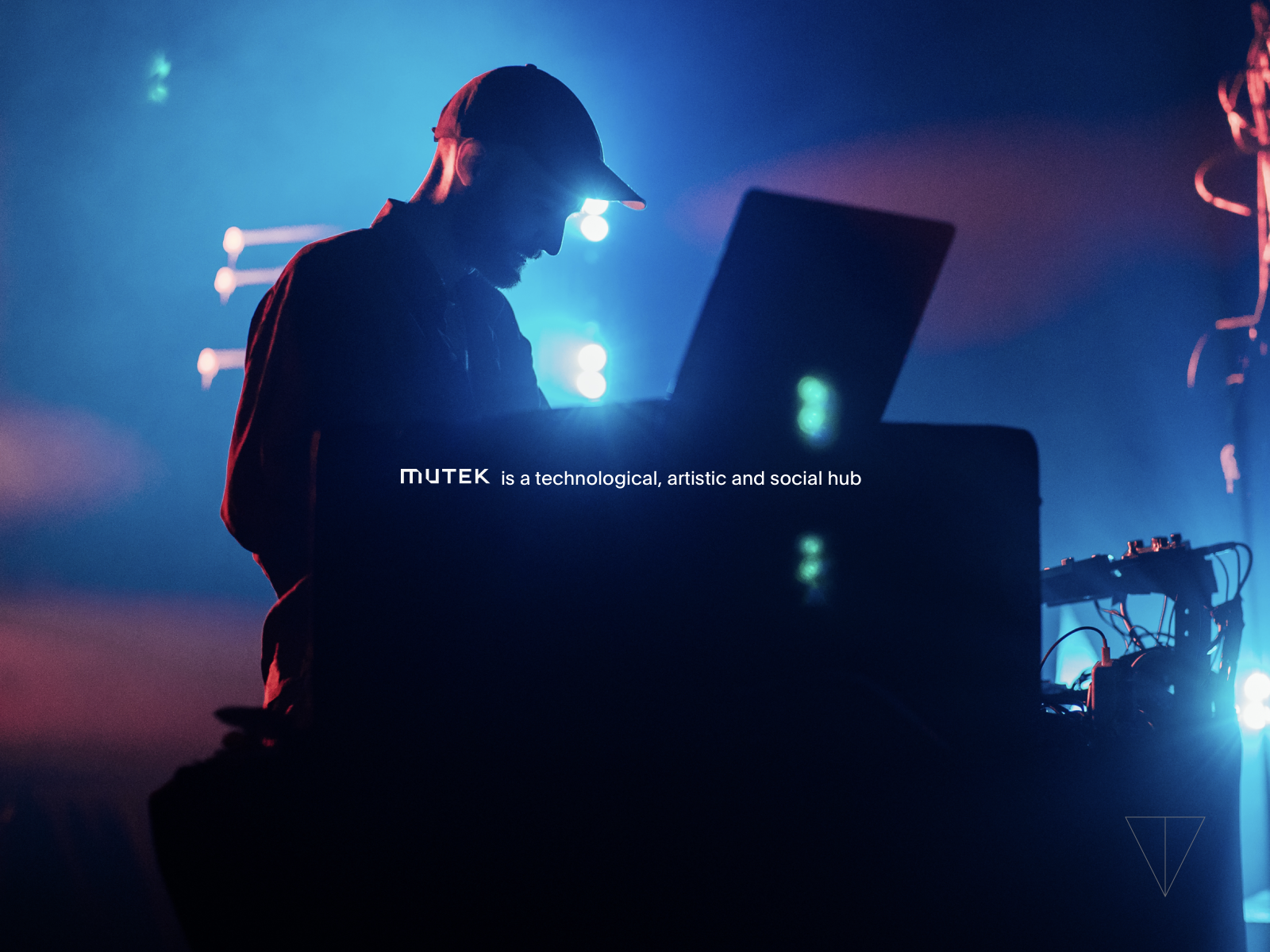
Mutek™ network is a technological, artistic and social hub. Mutek™ is an organization dedicat...
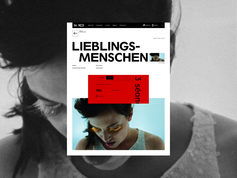
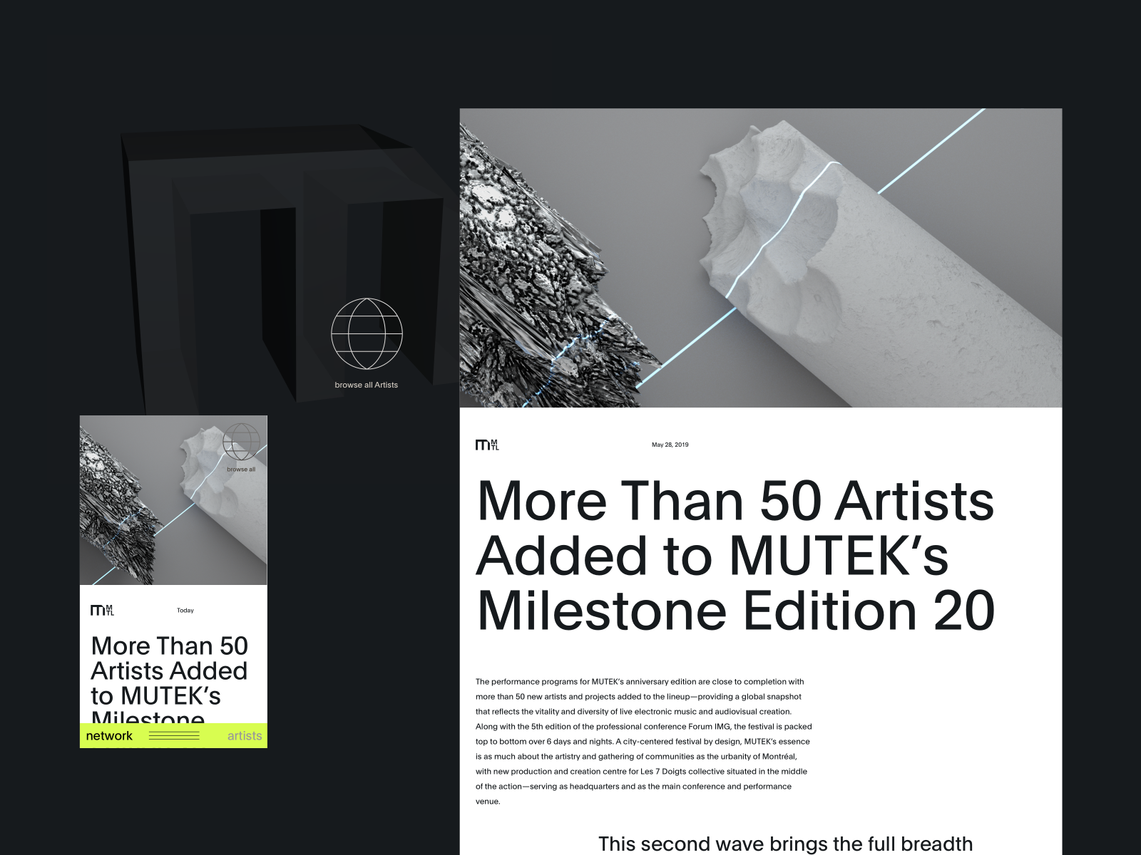
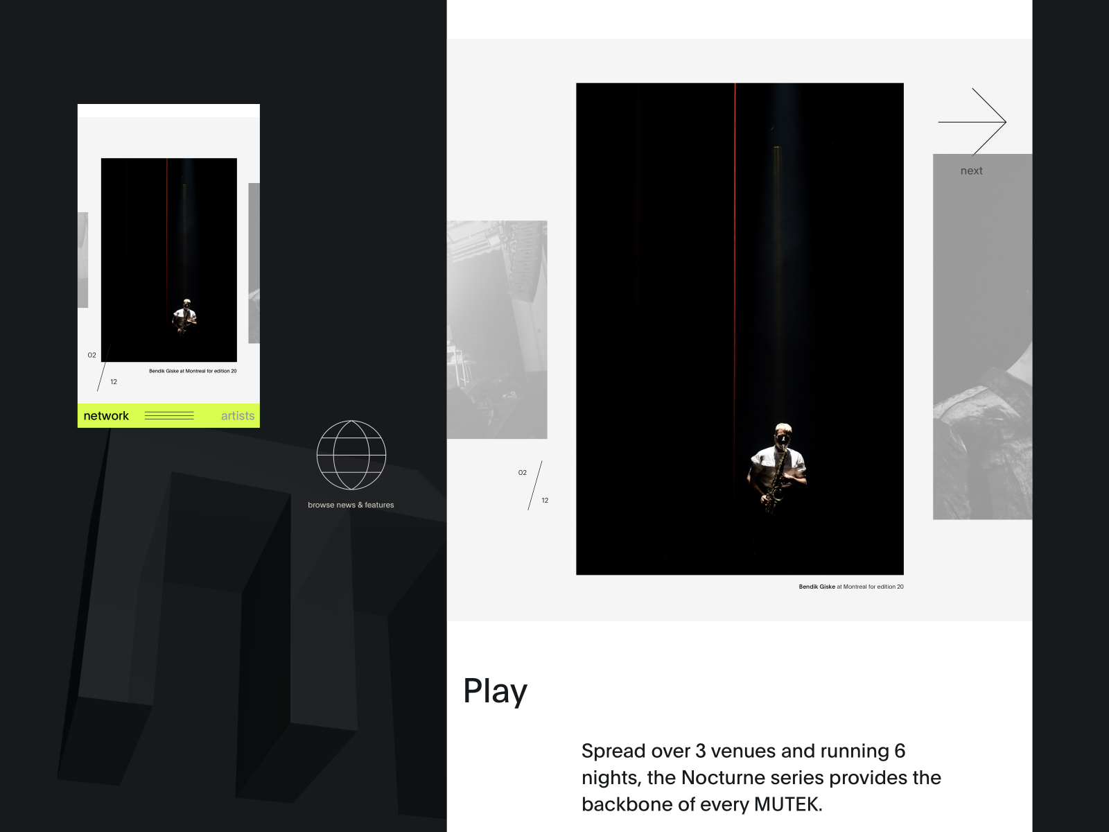
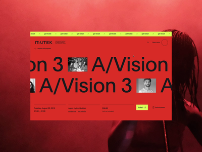
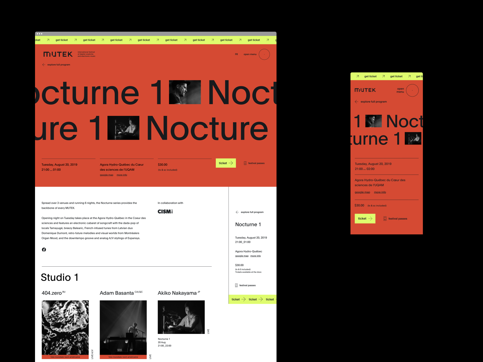
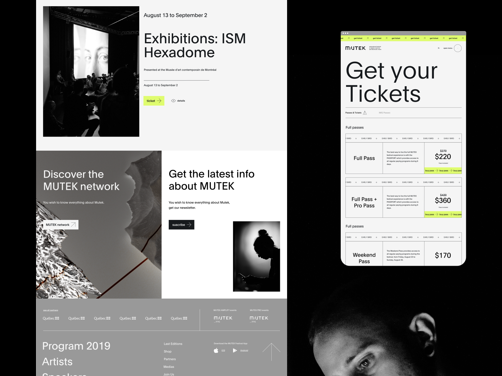
The user always has access to the main information with the sticky column on the right. The cover is more immersive to bring out the show. We imagined a design system that could work with any image format. User can easily go back to glob...
We use page transitions in an intelligent way to guide the user and introduce the titles.
Full project on behance.
Motion with the talented Victor Kurc.
Crafted at Akufen as Lead Art Director with best team ♥
See mutek™ montreal edi...
Think beforehand so that the design is the same on all devices.
Full project on behance.
Crafted at Akufen as Lead Art Director with best team ♥
See mutek™ montreal edition.
You can see the different artists of a show in the program page through an interactive autoplay slider. Pixel shorting animation fits very well with the digital universe of artist performances.
You can see the entire program page as att...