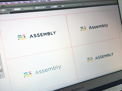
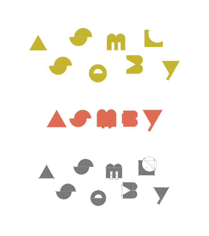
Working out some modifications as we get closer to finalizing the logotype for Assembly. These are not pixel perfect lock ups, just comparing directions at the moment and then picking a single option to refine and perfect.
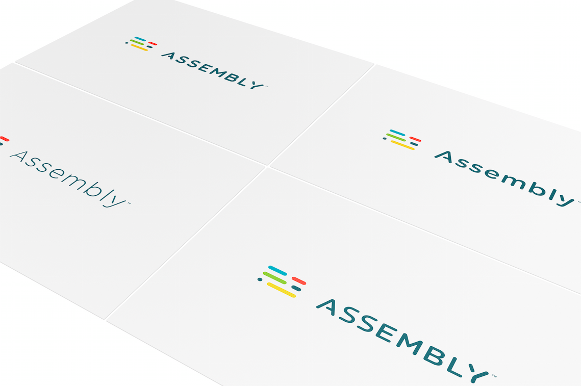
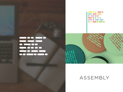
An updated look at the branding system coming together for Assembly. Stand by for some more awesome shots by @Jonathan Howell animating schtuff :)
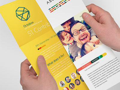
Note: All the content is just place holder.
Props to @Summer Teal Simpson for her work...
Another early concept.
Morse Code Flag. The short/long dashes used in the flag are all the proper segments used to spell the word Assembly, just not in order.
Full case study:
http://focuslabllc.com/our-work/assembly
---
Looking fo...
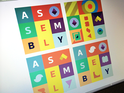
Going crazy with shapes, color and type. Still very early but I wanted to explore a way to get a rubik's cube type system that has a ton of variables and flexibility.
Props to @Summer Teal Simpson and @Jonathan Howell for their work on...
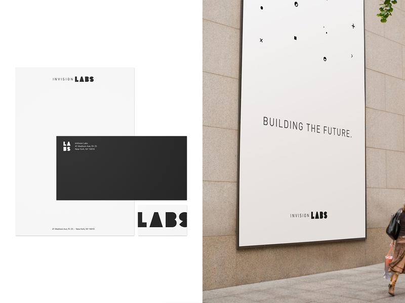
Working on a new branding project with @Jonathan Howell and @Summer Teal Simpson. This is a peek at some exploration this week around the concept of shapes and symbols.
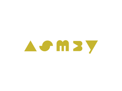
ASMBY - shortened for ASSEMBLY in the attachment.