In this guest post, Jaron Soh breaks down the top design-related conversion fails, and how you can easily avoid them so you increase signups, downloads, or purchases of your product.
Without question, design is a form of art. But increasingly, design also has a commercial purpose. As digital technology continues to dominate our lives, design has a huge role in shaping how we engage with online content. And if that content exists to get people to take a specific action (i.e. convert), the design needs to inherently support that goal.
In this post, we’ll explore eight design-related conversion fails, and give you some advice on how to avoid them. Let’s dive right in:
- Mistake 1: Relying too heavily on stock imagery (even when it’s high-quality)
- Mistake 2: Not allowing enough room to emphasize social proof
- Mistake 3: Overlooking the mobile experience
- Mistake 4: Using too many CTAs in a cluttered environment
- Mistake 5: Ignoring the user’s goal (and taste)
- Mistake 6: Failing to balance design with valuable information
- Mistake 7: Taking loading speeds for granted
- Mistake 8: Forgetting the value of consistency through the customer journey
Mistake 1: Relying too heavily on stock imagery
Stock has gotten better, without a doubt. But when you lean too heavily on stock imagery for a website or your blog posts, you’ll lose clout and credibility. This is particularly true for landing pages, where the reader makes a snap decision about whether to take action—to enquire, order, or download.
Potential customers need to see that you’re real, credible, and legitimate. They need product shots, unique illustrations, and team photos in order to build that trust—not free images taken off the internet.
How to avoid this fail:
Incorporate custom design into every phase of your content efforts, not just UI or UX projects. Make design a priority, or risk being lost among the competition. Opt for on-brand, custom illustrations rather than stock imagery.
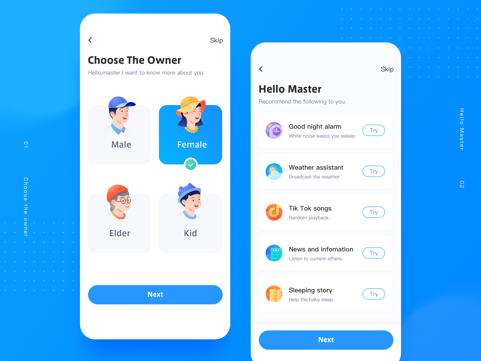
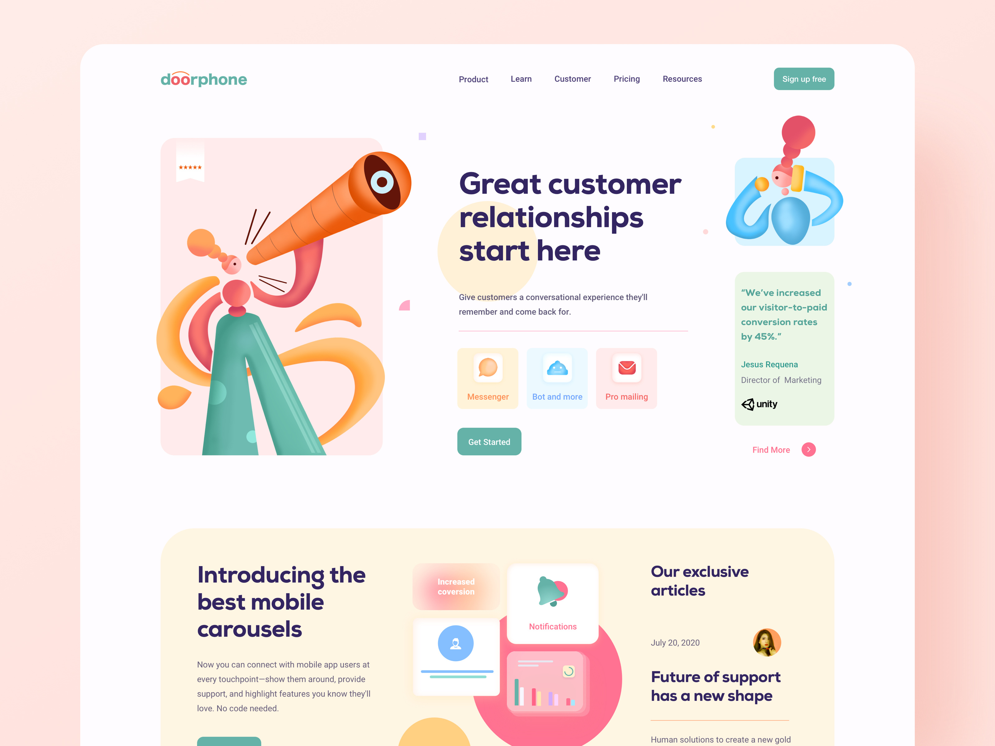
Example of getting this right: Sunnee on Dribbble uses custom, on-brand profile icons instead of generic profile headshots.
Mistake 2: Not leaving room to emphasize social proof
As the noise grows louder and competition increases in every industry, potential customers need to trust your brand—and quickly. The best way to earn this trust is to show that other people have had an amazing experience with your product or service. Put simply, social proof needs to be front and center when the intention is to convert users.
How to avoid this fail:
Think of smart ways to include social proof. It doesn’t need to be full quotes or testimonials, for example. Research how other successful brands incorporate social proof into their designs and take inspiration. Can social proof be visually presented without words?
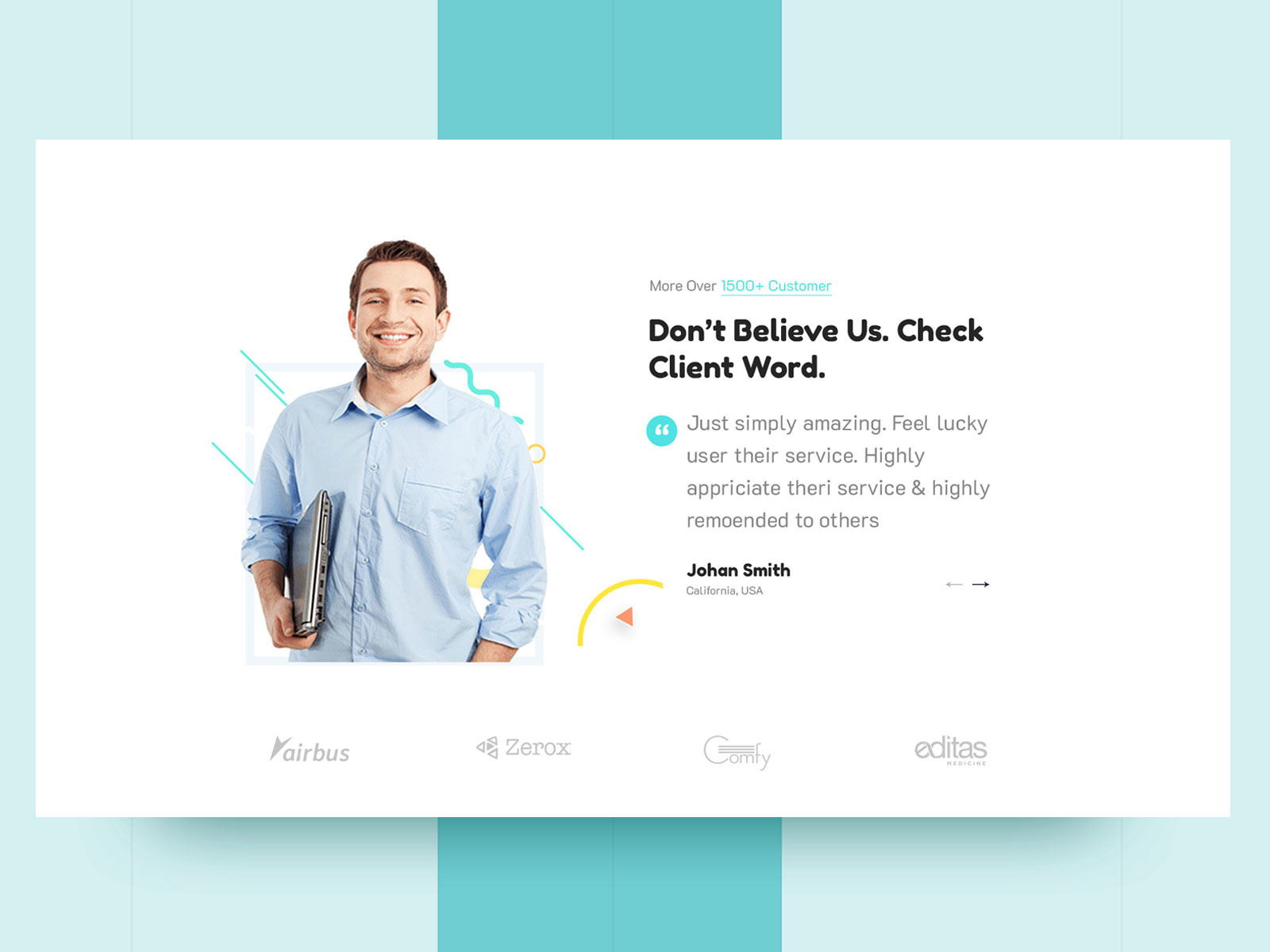
Example of getting this right: Suzon Abdullah on Dribbble mixes in user reviews, authentically articulated. Brand logos are shown at the base but do not necessarily take center-stage.
Mistake 3: Overlooking the mobile experience
Back in 2016, mobile overtook desktop as the device through which most people accessed the internet. It’s not acceptable if your mobile experience feels derivative and second-best.
Instead, mobile’s smaller screen, its portrait orientation, it’s tappable (not clickable) interactions demand dedicated design consideration. Otherwise, images and text get squashed and CTAs fall below the fold or off to the side—and you dissuade what may be a large section of your visitors.
How to avoid this fail:
Give mobile design as much time and energy as desktop design. And remember the specific formatting demands of designing for mobile—things like the so-called “fat-finger problem”, and vertical organization. Putting your efforts into the mobile experience will go a long way in getting more conversions.
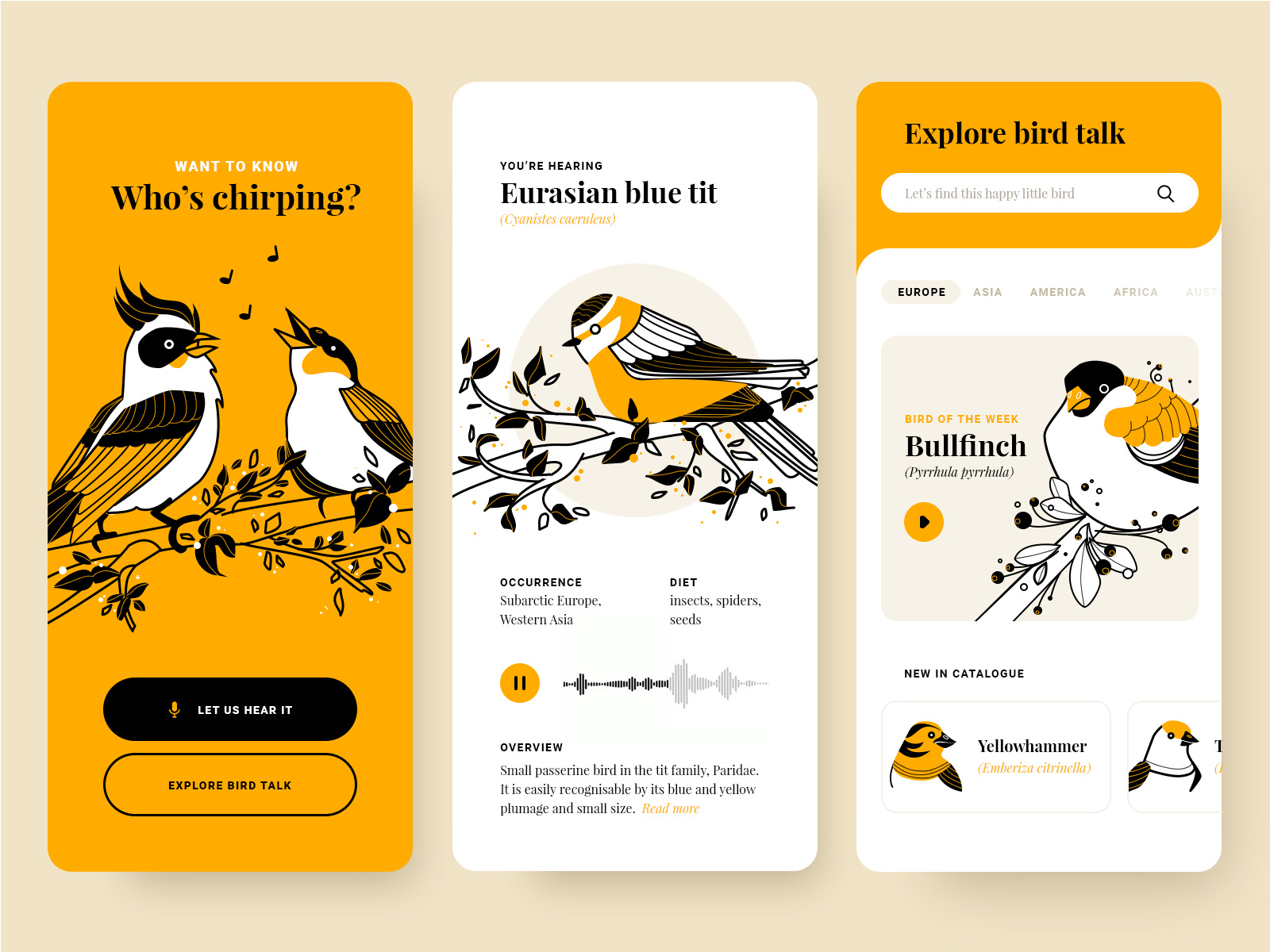
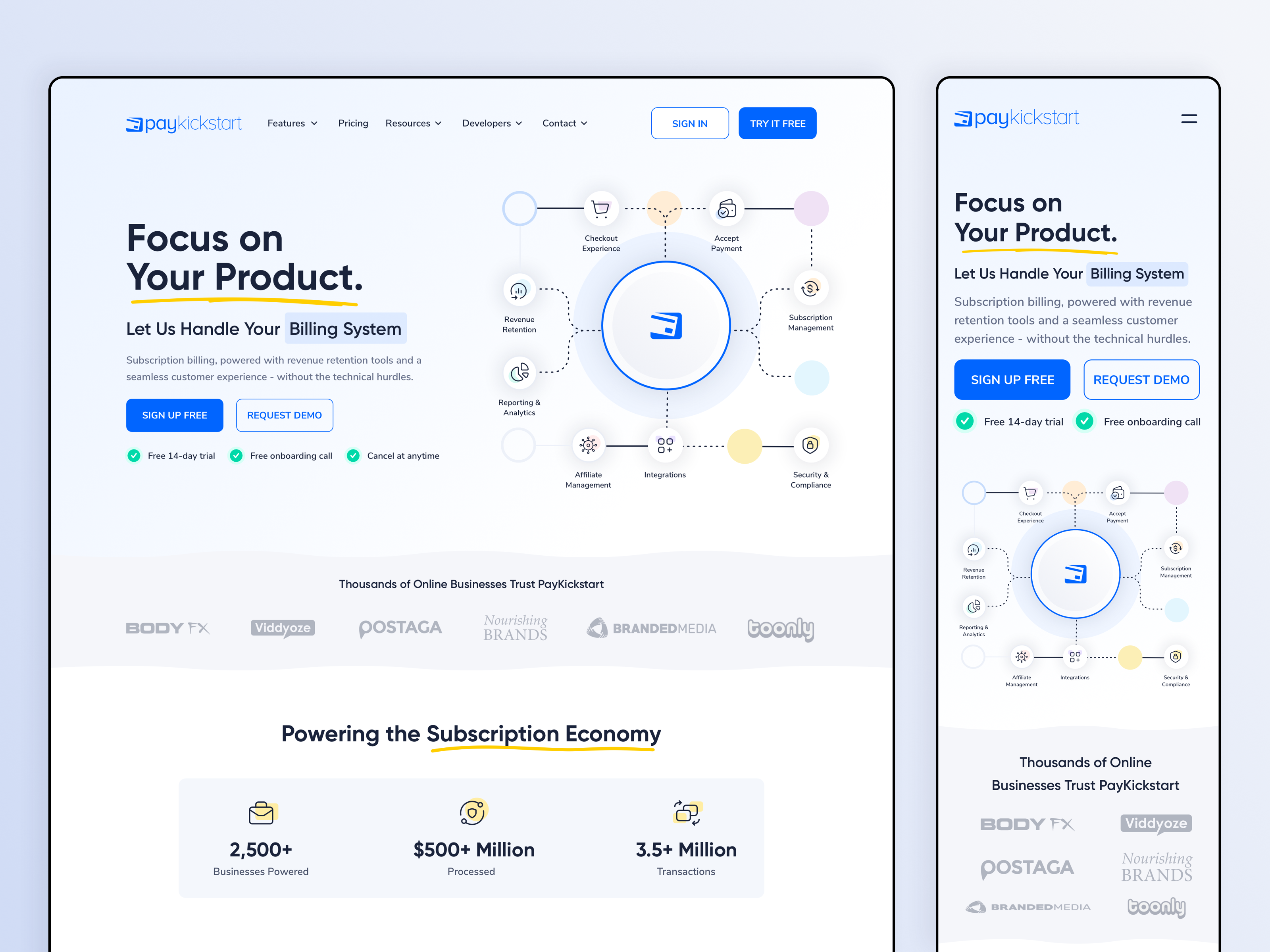
Example of getting this right: Fireart Studio on Dribbble fully optimizes for the mobile experience with this fantastic UI design.
Mistake 4: Using too many CTAs in a cluttered environment
The power of an effective call to action can’t be understated. Yet, it’s not “the more the merrier”. When users are offered too many choices, they become confused and their attention is divided. And this often means that they don’t click anywhere. The same applies with too few CTAs: if users aren’t led to a clear course of action, they leave. And that’s one less conversion.
How to avoid this fail:
To drive conversions, ensure that every landing page has one clear goal. If that goal is not clear to you before the design process begins, then it won’t be clear to your user either.
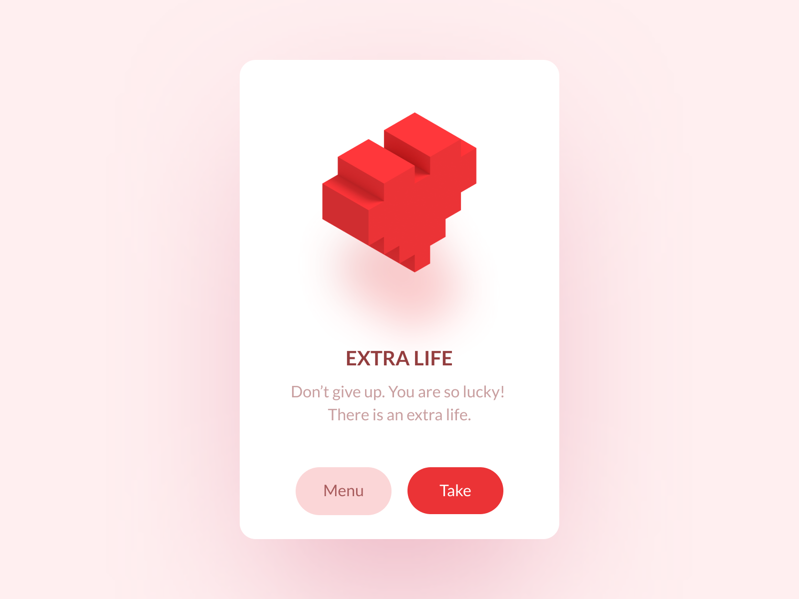
Example of getting this right: Oleg Frolov on Dribbble keeps it simple with just two short and sweet CTAs.
Mistake 5: Ignoring the user’s goal (and taste)
Design is an art, we’re agreed on that. But designers aren’t artists who can simply indulge their own tastes and impulses, only to forget their audience. If you overlook why a person landed in your website in the first place, they’ll just bounce. And the same happens if you turn them off with a style, color-scheme, and vision that clashes with their tastes. Forgetting that you’re not necessarily your user is one of the biggest strategic conversion fails that you can make.
How to avoid this fail:
Always keep the user top of mind. But first and foremost, find out who your user is. What does your audience actually respond to? What are they drawn to? What problem are they trying to solve? Do the research and test your designs to see what gets you the most results.
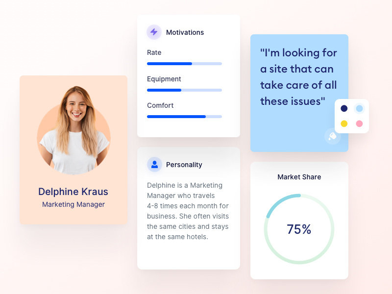
Example of getting this right: Valentin Salmon on Dribbble allows you to build user personas to understand your users’ motivations, personality, and market demographics.
Mistake 6: Failing to balance design with valuable information
Design won’t single-handedly lead users from engagement to conversion. Actual information (e.g. product details, FAQs, and customer reviews) still has a lot of work to do and shouldn’t be neglected in favor of good looks. Yet, text is also a design consideration.
When color, alignment, formatting, font, and length aren’t right, users get disorientated. They miss CTAs, and the value of content is diminished. The truth is simple: if users can’t find the information they’re seeking (and quickly) they’ll go elsewhere.
How to avoid this fail:
Combine design with content and copy to optimize UX copy from the beginning. This way, you can design a website where the text and visuals support each other and speak as one.
Example of getting this right: Emy Lascan on Dribbble getting the UX copy with clear headlines, value propositions, and a mobile-optimized design.
Mistake 7: Taking loading speeds for granted
High-quality visuals are an indispensable design feature for getting users to engage with your site and convert. But when graphics, images, and videos are too heavy, loading speeds suffer.
Every second added to loading time causes a 7% drop in conversions , so your sumptuous design might not be doing any favors for your bottom-line. Slow loading speeds also affect your SEO. That means you’re not only converting less, but also bringing in fewer visitors.
How to avoid this fail:
Using data compression tools can help make videos lighter without compromising quality. Meanwhile, removing audio from any muted videos and converting to HTML5 format can help, too.
Example of getting this right: Zuairia Zaman for Orizon: UI/UX Design Agency on Dribbble maintains a visually strong and rich website with the use of friendly scalable vector graphic (SVG) formats.
Mistake 8: Forgetting the value of consistency through the customer journey
Sites that lack a recognizable and uniform brand identity (fonts, graphics, colors, and copy) throughout the length of the customer journey look amateurish. Meanwhile, individual pages where quality is not as high can alienate users that were happily giving your site their time.
Fine-tune your social ads and landing pages, by all means. But if quality and tone aren’t consistent across every page, your audience won’t be able to build familiarity.
How to avoid this fail:
Map out your complete UX journey from social ads to checkout (and beyond), and refine every single stage obsessively. Meanwhile, setting brand guidelines from the get-go will help you achieve consistency throughout.
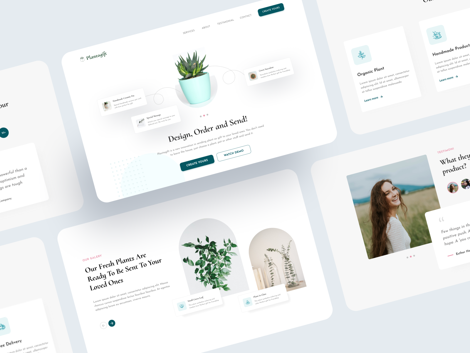
Example of getting this right: Mohammad Firdaus on Dribbble applies a clean minimalistic look, with on-brand geometry and typography across all pages of the site.
How to Avoid Design-Related Conversion Fails
When your content needs to maximize conversions, all parties who are involved in developing it need to have a deep understanding of what makes their audience tick. For design, crafting a seamless experience and user flow is of the utmost importance.
While there’s always room for creativity in design, this can’t come at the expense of the main goal—to increase signups, downloads, or purchases. You want to drive action. Conversion failures can occur due to all sorts of reasons—misalignment in messaging, excessive pricing, poor targeting, and the list goes on. But by remembering the eight design-related conversion fails we’ve mentioned in this post, you can make sure your design does the job. ■
![]() About the Author: Jaron Soh is the co-founder and COO of Traktion.ai, the platform to discover the world’s best marketers.
About the Author: Jaron Soh is the co-founder and COO of Traktion.ai, the platform to discover the world’s best marketers.
Find more Process stories on our blog Courtside. Have a suggestion? Contact stories@dribbble.com.


