A successful brand identity is important for any business, as it helps establish your personality and brand promise.
Whether you’re creating a brand identity for your own business or a client, understanding what goes into creating a successful visual identity is key to designing one with intention. Otherwise, it’s a shot in the dark to come up with something impactful that resonates with the brand’s clientele. Below are six key factors to consider that will help you create a successful brand identity design:
1. A defined brand voice
Before you can successfully create a brand identity, you need to know exactly what the brand is. What is the promise being made to the clients of the brand? You have to establish what this is before you can start working on the actual identity because the visual identity needs to consciously reinforce the brand voice.
Things to consider when defining a brand include how the brand stands apart from competitors, what the brand promises to customers, and keywords that describe the brand. Those keywords are especially helpful as you start to develop the brand’s visual identity. Use them to guide every visual choice along the way.
If the brand’s keywords are “modern,” “bold,” and “authentic,” you’ll want to keep those concepts in mind when choosing things like color palettes, typefaces, and images.
2. An intentional color palette
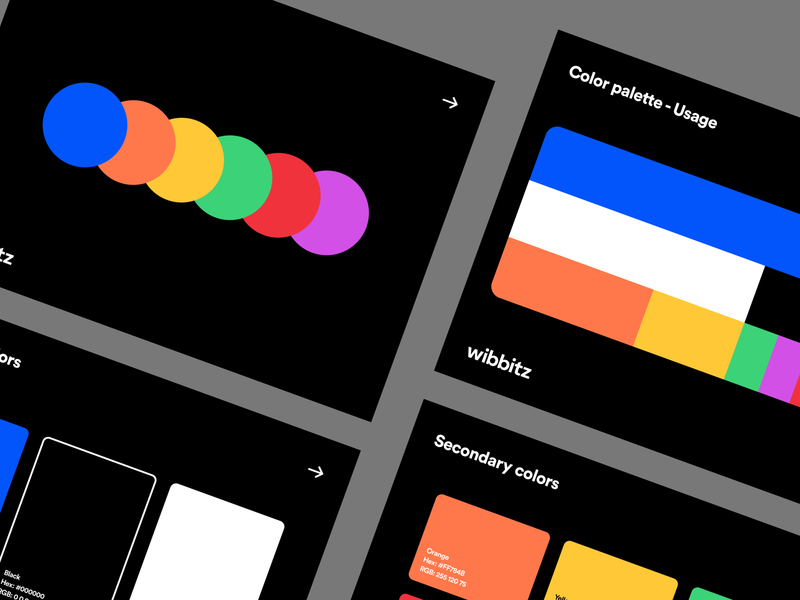
Color is one of the most powerful psychological and emotional factors in any design. The right color palette can give people exactly the impression you want to give them, while the wrong one can leave them feeling unbalanced and unsure.
It can seem like a lot of pressure to place on a single design element, but color is that important. It affects the way people feel about a company, as well as their purchasing behavior.
Familiarize yourself with the meanings behind various colors before you settle on the main color for any brand identity. Then consider what other values you might want to pull in to find secondary colors.
Nothing says you have to pick a color palette whose meaning perfectly fits the brand, but you’ll want to avoid picking colors that are antithetical to the brand’s keywords and values.
3. Typography that reinforces the identity
While color has an immediate impact on the emotions a brand will evoke, typography also plays an important role. Every typeface has its own personality and gives its own impressions. A well-chosen typeface reinforces the brand you’re trying to create, while the wrong typeface will be jarring for your potential customers.
For example, a brand that aims to be feminine and elegant shouldn’t build their typographic hierarchy around a typeface like Bombardier or Haymaker. Similarly, a corporate law firm likely wouldn’t want to use a typeface like Comic Sans.
There are some typefaces that are much more neutral and often suitable for use in virtually any kind of brand identity, but the downside to these is that it’s hard to make them stand out from every other brand that uses them (consider how many brands use Helvetica, as just one example). You’ll have to work harder to make them uniquely associated with the brand identity you’re designing.
4. A unique logo + wordmark
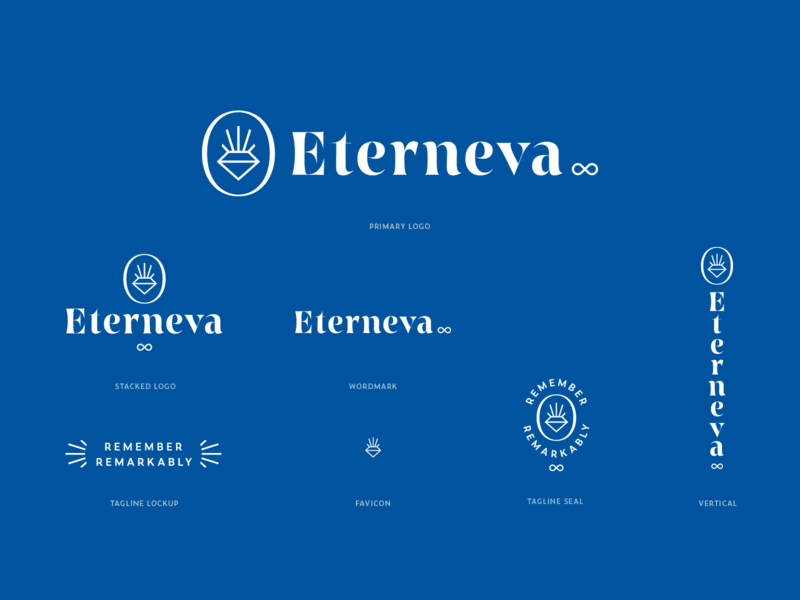
You need more than one version of a logo. One should be the graphical logo by itself, but the other should include a wordmark (also referred to as a logotype) alongside the graphical representation. Sure, companies like Apple or Toyota might be recognizable just from their logo, but the vast majority of brands are not. Having a wordmark that goes alongside the logomark better establishes the brand identity.
I’ve seen examples where a company thought their logomark should be immediately identifiable and refrained from using their wordmark alongside it—and it was definitely not recognizable to the average person landing on their website from search results. These are huge missed branding opportunities and almost certainly had a negative impact on their brand.
5. Brand reinforcement
Don’t overlook opportunities to reinforce a brand. As mentioned above, companies often overlook areas where they can reinforce their brand identity.
Any content a company releases should be branded to represent them whenever possible. That doesn’t necessarily mean they have to slap their logo on everything, but it does mean that the content should reinforce the brand values.
In visual content, that could mean incorporating a particular visual style that becomes iconically associated with that brand, using the brand color palette, or similar visual cues that slowly build awareness and recognition of the brand.
6. Consistency
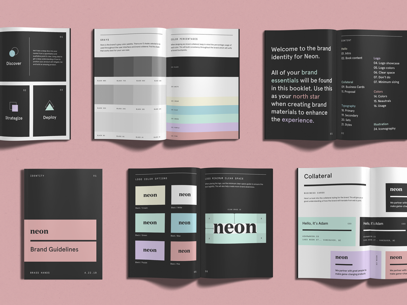
One of the worst mistakes you can make in establishing a successful brand identity is to be inconsistent. Big brands have specific guidelines for how things like their logos, wordmarks, brand colors, and other elements should be used. Take the time to set up brand guidelines for any brand identity you design so visual elements can be used consistently.
Brand guidelines should spell out exactly what the brand colors are (include the hex codes and RGB values), how the logos are used, what typefaces to use and how, and even the kinds of images to use in things like ads or social media posts (should they always include people or plants or something similar? Should they never include those things? etc.). Include guidance on things like the language to use and not to use, too. Brand guidelines don’t have to be complicated, but they should be easy to reference so they’re actually followed.
Whether you’re designing your own brand identity or one for a client, consistency is key to creating a visual identity that’s recognizable and reinforces the brand’s messaging. Consider every piece of content the brand releases to the world and be sure it fits within the brand’s style and standards ■
![]() About the Author — Cameron Chapman: Editor. Blogger. Author. Designer. Copywriter. Marketer. Entrepreneur. Speaker. Consultant. Coach. I wear a lot of hats. What most of them have in common, though, is storytelling.
About the Author — Cameron Chapman: Editor. Blogger. Author. Designer. Copywriter. Marketer. Entrepreneur. Speaker. Consultant. Coach. I wear a lot of hats. What most of them have in common, though, is storytelling.
RELATED READING
- 10 key questions to ask clients before you start designing
- How to incorporate illustration into a branding project
- How to design a strong visual identity for digital products
- What is the role of a Brand Strategist? 5 experts share
Find more Process stories on our blog Courtside. Have a suggestion? Contact stories@dribbble.com.


