close

12 helpful mini‑tutorials to quickly boost your design skills

If you’re ready to learn some handy tips & tricks you never knew you needed, you’re in the right place. Designers have been generously sharing their knowledge through some extra helpful visuals, and we’ve rounded them up just for you in this blog post.

Check out the Shots below that each feature a quick design tip, tutorial, or how-to for all kinds of creative practitioners—graphic designers, illustrators, UI designers, you name it. To view each mini-tutorial, make sure you click on the Shots to expand them!

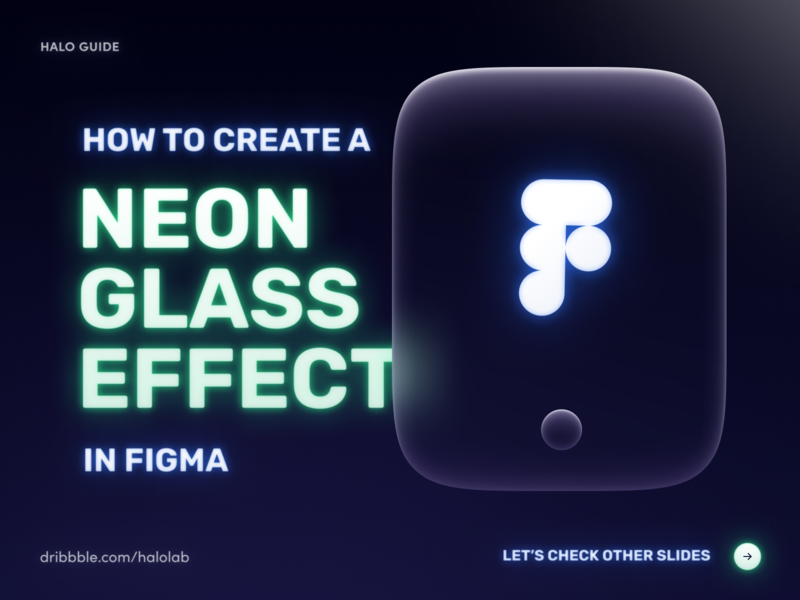
Neon Glass Effect Figma Guide brand identity brand sign branding card dark design design trend education effect glass glow guide halo lab identity logo neon packaging sign trend tutorial
Shot Link

Neon Glass Effect Figma Guide

by Halo Branding for HALO LAB

Each time the response to our guide exceeds all kinds of expectations. So we won't anticipate it. We'll just share it with you and wait for your reaction to this neon tutorial ✨. Inspired by @Volorf awesome motion and added a mix of our previous guide....

View on Dribbble

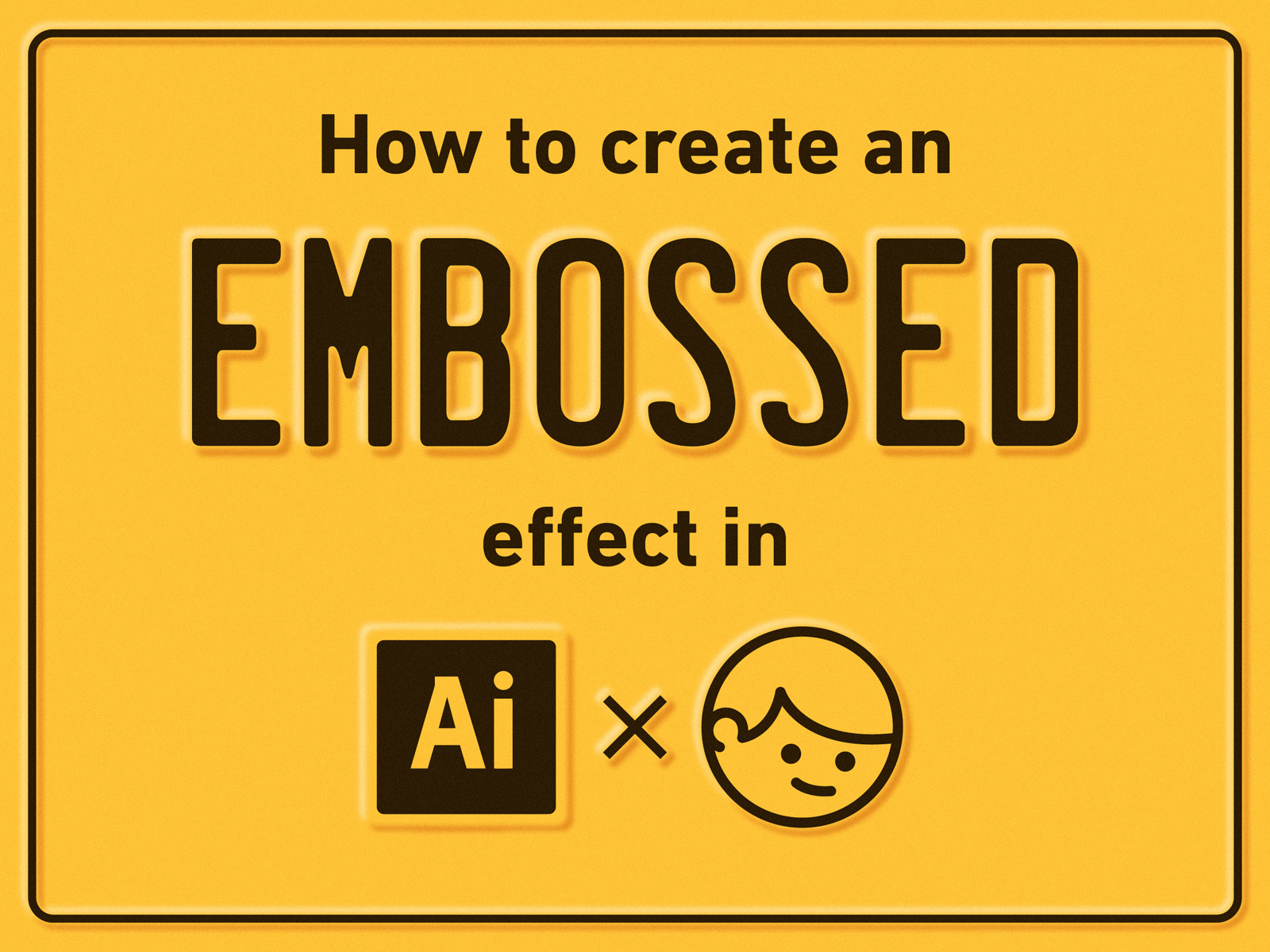
How to create an embossed effect in Ai adobe blur design freebie graphic design illustration illustrator license metal plate retro simple tutorial vector vintage
Shot Link

How to create an embossed effect in Ai

by Gustavo Zambelli

Some of you asked about how I did this effect and here is my answer!

View on Dribbble

How to Create a Perfect Dropdown design agency design tip design tips designagency designthinking dropdown product design tips ui design uidesign user interface design user interface ui userexperiance userexperience userexperiencedesign userinterface ux design uxdesign
Shot Link

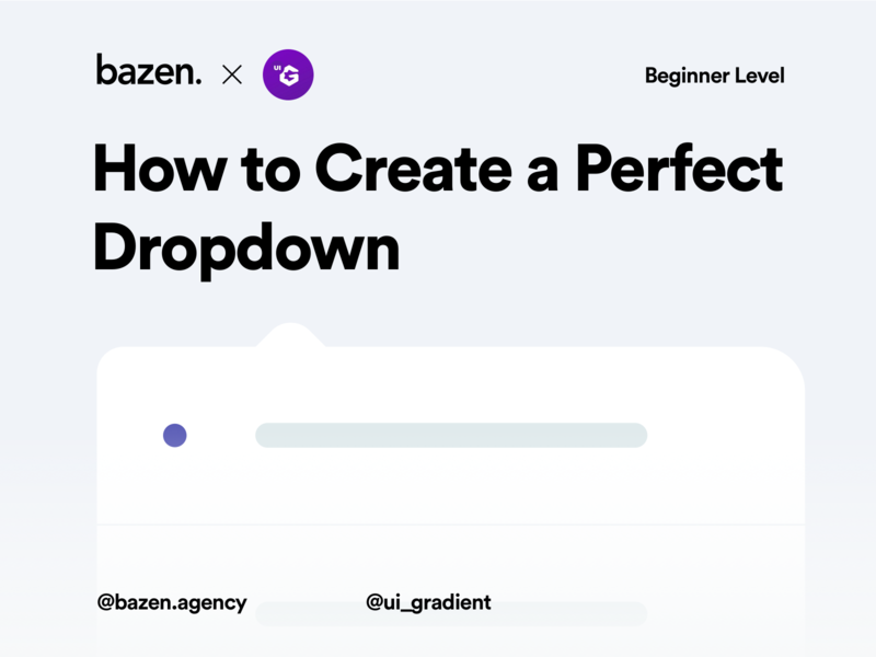
How to Create a Perfect Dropdown

by bazen.talks

Design by @Marko Dostanic _ Every designer needs to know how to make a good dropdown. In today's post we will show you how to do that in the right way! 👌🏼 _ Almost every project or client will demand from you to show some kind of list, categories, f...

View on Dribbble

Using Illustrator's Roughen Tool armadillo cartoon illustrator illustrator art retro rough texture tutorial vector vintage
Shot Link

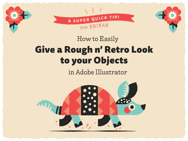
Using Illustrator's Roughen Tool

by Erikas

*Updates to tutorial made June 2020* A little tutorial showing how to simply use the Roughen and Width tools in illustrator to give your vector designs a little vintage edge!

View on Dribbble

Shot Link

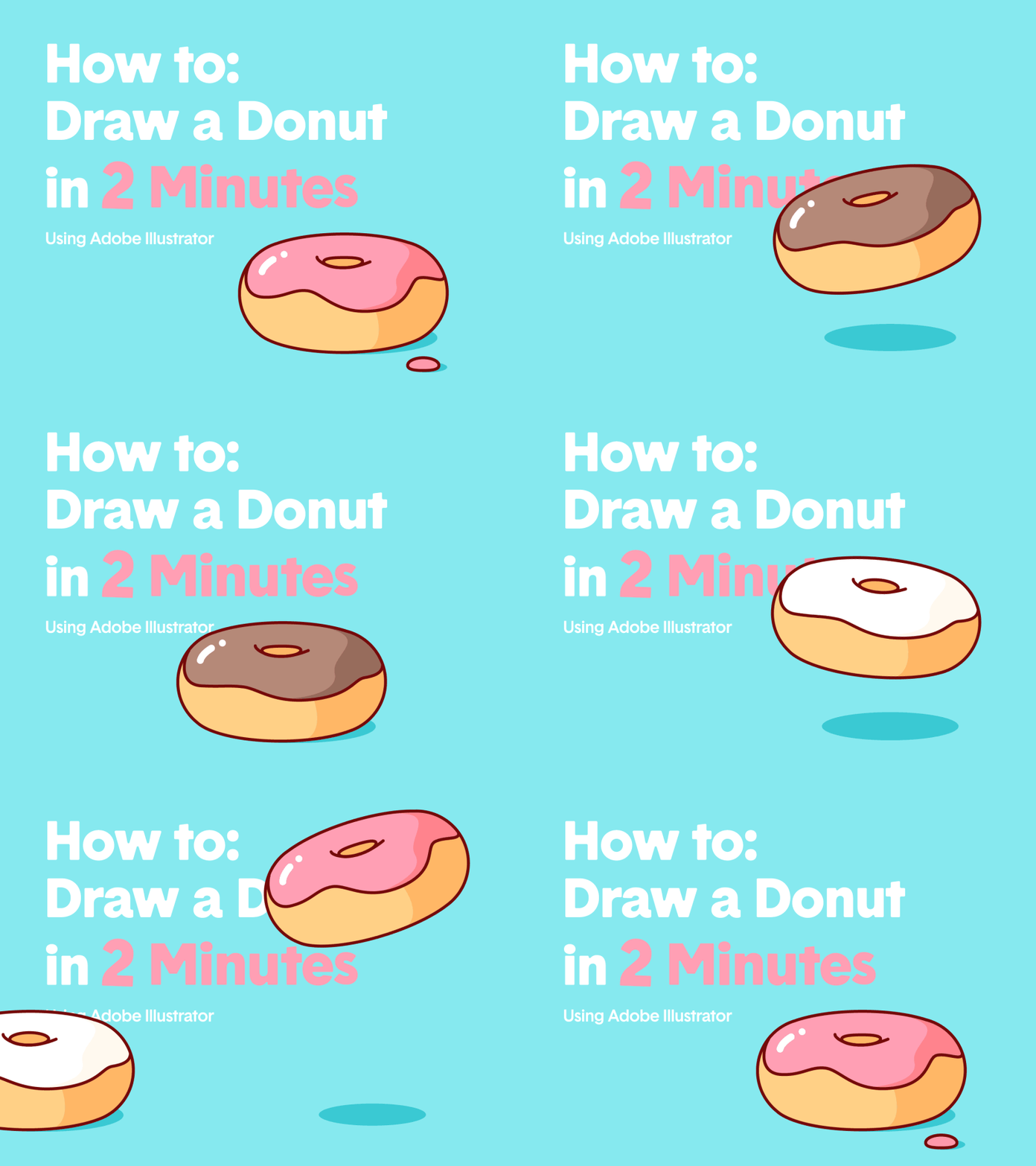
How To: Draw A Donut

by Burnt Toast ®

Draw a delicious looking donut in less than 2 minutes following these 4 easy steps in Adobe Illustrator 👉 🍩 💕 See Attached! Instagram | Facebook | Behance

View on Dribbble

How to Create an Enamel Pin - Figma Guide brand identity brand sign branding design figma figma design figma tutorial guide halo lab identity identity design logo logo design logotype packaging rebound tutorial
Shot Link

How to Create an Enamel Pin - Figma Guide

by Halo Branding for HALO LAB

Our long-awaited guide. We’ve been thinking for a long time about what’s interesting to prepare and decided to create a guide about enamel pin. It seems to be right in the season. Examine it, create your enamel pin, publish it and tag us. We love to se...

View on Dribbble

Shot Link

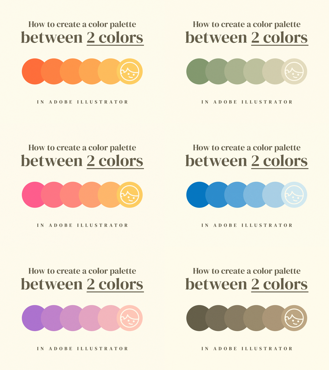
Create a color palette between 2 colors

by Gustavo Zambelli

I didn't know this trick until 2 years ago and it's very helpful in my everyday work. I hope this will helpful for you guys!

View on Dribbble

UI Tip - How to Improve Typography in Your IG Posts design agency design tip design tips designagency designerlife designtips typographic typography typography design typographydesign ui uidesign uidesigns uiux uiuxdesign uiuxdesigner userexperience userexperiencedesign userinterfacedesign uxdesign
Shot Link

UI Tip - How to Improve Typography in Your IG Posts

by bazen.talks

Why is typography super important? 🙌 _ Design by @StefanTosic _ What is the basic and primary function of a text? Successfully sending of the message. How can we convey a message if our typography is dysfunctional or over the top? Therefore, it is...

View on Dribbble

5 Tips for Better Letters brush calligraphy hand lettering lettering type typography
Shot Link

5 Tips for Better Letters

by Ian Barnard

Here are 5 tips for better letters 1. Letter 'E' - The middle arm should be made a little shorter otherwise optically it will look like it's sticking out further than the top and bottom arms 2. Letter 'S' - Top half is slightly narrower than the botto...

View on Dribbble

Tips for Building your audience and Attracting clients building audience getting clients illustration infographic information keynote sharing slides tips tricks watermelon
Shot Link

Tips for Building your audience and Attracting clients

by Justas Galaburda

JUST PUBLISHED A NEW ARTICLE ON MY BLOG ✨ - What type of work to create and share to build your audience or attract more clients? I know that I’m not the only one who gets hesitant when it comes to sharing work online. What kind of work should you cre...

View on Dribbble

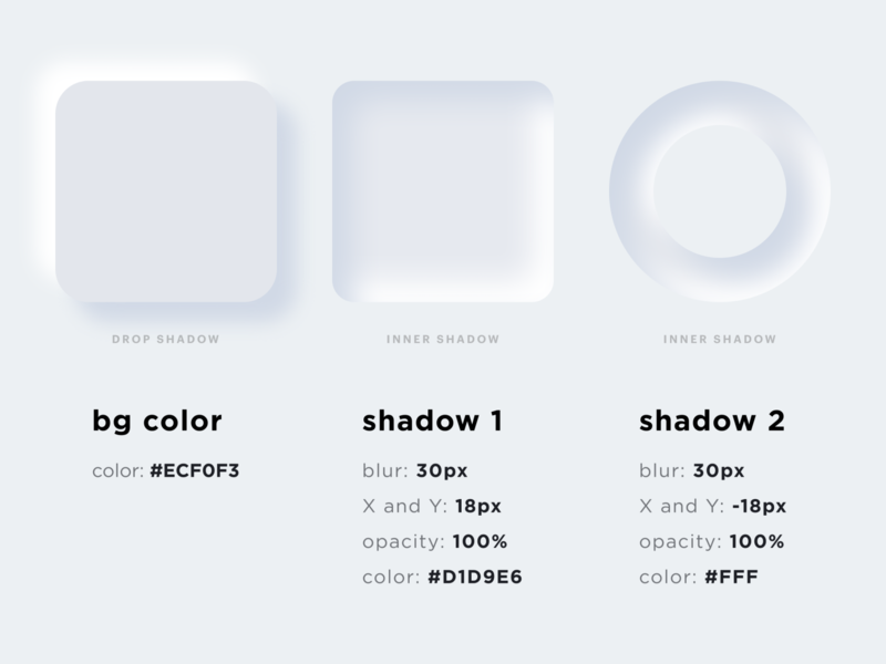
Neumorphism UI Trend 2020 2020 trend clean dark theme design trend figma guide illustration light neomorphism shadows skeuo skeuomorph skeuomorphism soft ui tutorial typography ui ui trend user interfaces white
Shot Link

Neumorphism UI Trend 2020

by OTAKOYI

Hello Everyone! Have you already heard about the recent UI trend called “New skeuomorphism” or Neumorphism? Skeuomorphism describes how interface objects imitate/mimic their real-world counterparts in how they look or how you can interact with them. Neu...

View on Dribbble

Find more Process stories on our blog Courtside. Have a suggestion? Contact stories@dribbble.com.
Previous
Next