Compacting the Settings window


More or less nailed the design and interaction of a Backup Settings dialog.
The animated version of it in action is attached.
---
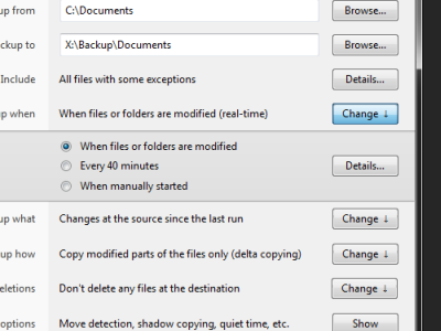
To explain the context - the main issue was that there's quite a few important settings and ideally they should all be kept on a single page, allowing for a at-a-glance inspection and a quick adjustment. This, however, makes the window too tall and leads to people complaining that it doesn't fit on their screens. Alternatively, it can use some sort of columnized layout, but that looks plain odd.
Hence the solution of showing only the current setting, but allowing to change it in-page if needed.
Lesser settings are tucked away behind the Show button at the bottom. The "Include" configuration is a complex one, so it's the only one that gets its own window. Or perhaps, I'll do a wizard-style page switch, recycling the window, but replacing the content with "Include" configuration controls.
In any case, there were several other options leading to this one - http://bvckup2.com/wip - have a look if interested.
