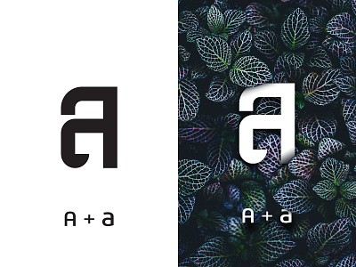
A + a Logo Concept
Here is a little Logo I whipped up using the letter A. I had the idea to combine both upper and lowercase together which I've not been done before. Would be easy if you were doing a letter like C though haha.
Would love to hear your thoughts
More by Robert Nowland View profile
Like
