Boomski
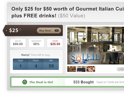
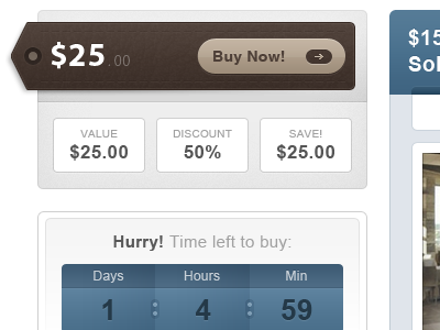
Gives a better idea for the structure. This is going below a large blue header the same width. Theres also a 200px wide side bar with blue headers (the time box matches the header & side bar content).
More by Hunter Hastings View profile
Like

