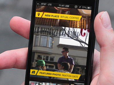
visual activity stream
this view was designed to show new system activity of several types -- each of the activity types had some kind of photographic asset, so I decided to try something visual and easy to skim/digest.
this is another view that didn't really become magic until we got it into code and got the animations working properly. the idea was to try and use square viewports so as to show more than one item on screen at a time, but use a "parallax" (I know) effect so the square viewport pans over the surface of the entire photo by the time it reaches the top of the screen. we also added some slick 'load-in'/'load-out' animations to the labels so that only one was showing at a time. I liked this UI because it was a good exercise in prototyping animations and motion graphics in Keynote and other tools, but also a reminder that You Never Quite Know until you see it on the device.
