Twitteriffic with a bit more space
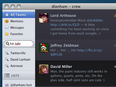
Just a small tweak to David Lanham's Twitteriffic screenshot. I think what's making it looked cramped is the space around each grouping, rather than the space between each item. Of course the downside to adding some space is the gap you'll get when the first or last item is selected, but I think it's worth it. I greatly prefer these icons, by the way, and I find them just as readable.

