Spotify
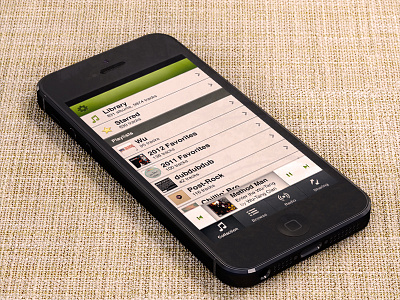
Is it still cool to redesign stuff? I've been meaning to do this for a while and finally started the other day. I like the way it turned out. You should check out the full view attachment on your phone some time (excuse the doubled styles, it's late).
I'm trying to change both the interaction design and visual design to be something more like what I want out of Spotify's iPhone app. They probably wouldn't be down with losing "What's New" but that shit can go in Browse.
Sharing, by the way, would be conversations like in Facebook Messenger. I really wish they'd take that on themselves instead of leaning so hard on Facebook. I want a messages scenario with group conversations. So I can always share my sweet rap finds with my sweet rap buds.
I haven't decided what goes in the navbar on this view.
Used Dash's iPhone 5 for the shot.

