Travel Payment Design
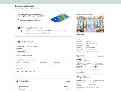
I find that the payment page is one of the most important pages and it always needs to be tested to ensure a better experience for users to buy, add their personal information, credit cards, add more options and etc., This is a redesign of a payment page that I've done for a travel website.
Hit "L" if you like it :)
Follow me:
Dribbble: http://bit.ly/fahim-dribbble
YouTube: http://bit.ly/fahimmd-sub
desktop.png
700 KB
More by Fahim MD View profile
Like
