Daily UI #071 - Scheduling
Thoughts on Today’s Challenge
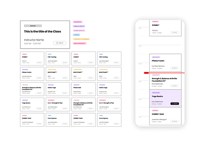
I wanted to change up how I approach completing today’s challenge. Normally I focus on the aesthetics of the final layout, carefully selecting vibrant colors and dynamic imagery. Sometimes, I would even stretch the fabric of what is “possible” for the sake of making a layout “look cooler”. Today, I wanted to stretch out my technical muscles crafting a mini design system, showing a glimpse of my process as well.
To get me started, I borrowed some data from a local gym, SF Fitness. They have a nifty little grid to display when and which classes are going on weekly. Since the data is available online, I could easily grab it and throw it into Figma. The first step is cleanly separating all of the data points so nothing is overlapping or too close together. The less visually cluttered the workspace is, the easier it is for me to wrap my mind around a design concept. In this case, I C&P'd each cell individually so I could keep them in the proper order.
After the collection of data is arranged on my canvas, I first identify the outliers (longest names, shortest names, any unique oddities, etc.). These points help determine breaking points of values I can use for specific pieces, and most importantly how many lines of text will be needed for titles or subtitles. After those points are identified, then I start brainstorming and sketching potential ways to componentize the data. This usually equates to me scribbling in my sketchbook, drawing random shapes and grids, staring intently into space until the mish-mash of ideas in my mind coagulates.
For my design here, I wanted to show the actual component and badges I created in Figma. Getting to this level of fidelity always takes a few iterations (if not dozens). However, if I start with creating a working component system, it greatly increases the speed at which I can iterate. The mockup to the right is to give a better idea of how these components would look in an app. Also, I want to start expanding the scope at which I work, hopefully soon being able to focus on one large design system.
In conclusion, I enjoyed switching gears today and trying something slightly new. Even though the final presentation isn’t super flashy, I think that is perfectly OK. The sexiness doesn’t come from aesthetics, rather it comes from the craft of the system itself, and the attention to detail.
“Form follows function”
-- -- --
Thanks for checking out my post!
Press “L” to like my shot and to keep me motivated to make it to the end! Feel free to leave any feedback as well, all words are welcome. 😋👍
-- -- --
The Challenge is to complete one unique User Interface design task every day, for 100 days. You can read more about it here: https://www.dailyui.co/
