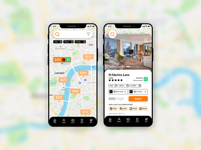
Daily UI #067 - Hotel Booking
Thoughts on Today’s Challenge
I enjoyed crafting today’s challenge and I am happy with the final result. When I work on these challenges I tend to stick to consistent design elements (colors, typography, 8pt grid, icons) which has helped me a lot with hammering out prototypes. Now that I am on the 67th challenge, all the work and effort from previous challenges are paying off. The amount of time I spend on each task is going down, and the quality is going up! At least, in my opinion 😋
The concept I had for this design would go beyond these two static screens. Each component would flow up and down and left to right, to give the app a sleek and sophisticated feel. In this example, after a user taps a hotel label (screen 1) the label would expand and saturate, exposing a star count plus average user rating. On the second tap, the user would arrive at the second screen. Each card would slide up revealing the images/content while the search bar contracts into a circle.
My goal in the future would be to animate my UI ideas, probably with a program like Principal. I see so many awesome posts on here that I would love to try to replicate, but I don’t have the proper tools or knowledge, yet. I can’t wait to get to that level as a designer.
-- -- --
Thanks for checking out my post!
Press “L” to like my shot and to keep me motivated to make it to the end! Feel free to leave any feedback as well, all words are welcome. 👍
-- -- --
The Challenge is to complete one unique User Interface design task every day, for 100 days. You can read more about it here: https://www.dailyui.co/
