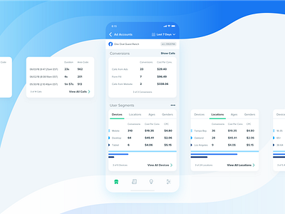
AdHawk iOS - Facebook Ads Conversions & User Segments
When re-designing the AdHawk iOS app, we wanted to ensure that the card structure was extremely modular. In this shot, two of the card structures (for Conversions/Calls and User Segments) are shown, with many similarities as well as some unique qualities to visualize data.
Tables on mobile can get cluttered quickly, so the goal was to make information more digestible, in smaller sections, and to contextualize how many items were available to view.
More by Max Burnside [Available for projects] View profile
Like
